In February, this paper claimed there’s a 75% chance the next El Niño will arrive by the end of 2014:
• Josef Ludescher, Avi Gozolchiani, Mikhail I. Bogachev, Armin Bunde, Shlomo Havlin, and Hans Joachim Schellnhuber, Very early warning of next El Niño, Proceedings of the National Academy of Sciences, February 2014. (Click title for free version, journal name for official version.)
Since it was published in a reputable journal, it created a big stir! Being able to predict an El Niño more than 6 months in advance would be a big deal. El Niños can cause billions of dollars of damage.
But that’s not the only reason we at the Azimuth Project want to analyze, criticize and improve this paper. Another reason is that it uses a climate network—and we like network theory.
Very roughly, the idea is this. Draw a big network of dots representing different places in the Pacific Ocean. For each pair of dots, compute a number saying how strongly correlated the temperatures are at those two places. The paper claims that when a El Niño is getting ready to happen, the average of these numbers is big. In other words, temperatures in the Pacific tend to go up and down in synch!
Whether this idea is right or wrong, it’s interesting—and it’s not very hard for programmers to dive in and study it.
Two Azimuth members have done just that: David Tanzer, a software developer who works for financial firms in New York, and Graham Jones, a self-employed programmer who also works on genomics and Bayesian statistics. These guys have really brought new life to the Azimuth Code Project in the last few weeks, and it’s exciting! It’s even gotten me to do some programming myself.
Soon I’ll start talking about the programs they’ve written, and how you can help. But today I’ll summarize the paper by Ludescher et al. Their methodology is also explained here:
• Josef Ludescher, Avi Gozolchiani, Mikhail I. Bogachev, Armin Bunde, Shlomo Havlin, and Hans Joachim Schellnhuber, Improved El Niño forecasting by cooperativity detection, Proceedings of the National Academy of Sciences, 30 May 2013.
The basic idea
The basic idea is to use a climate network. There are lots of variants on this idea, but here’s a simple one. Start with a bunch of dots representing different places on the Earth. For any pair of dots 

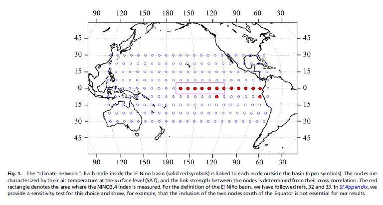
The papers by Ludescher et al use this strategy to predict El Niños. They build their climate network using correlations between daily temperature data for 14 grid points in the El Niño basin and 193 grid points outside this region, as shown here:

The red dots are the points in the El Niño basin.
Starting from this temperature data, they compute an ‘average link strength’ in a way I’ll describe later. When this number is bigger than a certain fixed value, they claim an El Niño is coming.
How do they decide if they’re right? How do we tell when an El Niño actually arrives? One way is to use the ‘Niño 3.4 index’. This the area-averaged sea surface temperature anomaly in the yellow region here:

Anomaly means the temperature minus its average over time: how much hotter than usual it is. When the Niño 3.4 index is over 0.5°C for at least 5 months, Ludescher et al say there’s an El Niño. (By the way, this is not the standard definition. But we will discuss that some other day.)
Here is what they get:

The blue peaks are El Niños: episodes where the Niño 3.4 index is over 0.5°C for at least 5 months.
The red line is their ‘average link strength’. Whenever this exceeds a certain threshold 
The green arrows show their successful predictions. The dashed arrows show their false alarms. A little letter n appears next to each El Niño that they failed to predict.
You’re probably wondering where the number 


But what about their prediction now? That’s the green arrow at far right here:

On 17 September 2013, the red line went above the threshold! So, their scheme predicts an El Niño sometime in 2014. The chart at right is a zoomed-in version that shows the red line in August, September, October and November of 2013.
The details
Now I mainly need to explain how they compute their ‘average link strength’.
Let
For each day 

Let 

They call
(A subtlety here: when we are doing prediction we can’t know the future temperatures, so the climatological average is only the average over past days meeting the above criteria.)
For any function of time, denote its moving average over the last 365 days by:

Let 


Note that this is a way of studying the linear correlation between the temperature anomaly at node 
Ludescher et al then normalize this, defining the time-delayed cross-correlation 
This is something like the standard deviation of 
They define 

and normalizing it. So, this is about how temperature anomalies outside the El Niño basin are correlated to temperature anomalies inside this basin at earlier times.
Next, for nodes 

They define the link strength 
Finally, they let 

They compute
There’s more to say about their methods. We’d like you to help us check their work and improve it. Soon I want to show you Graham Jones’ software for replicating their calculations! But right now I just want to conclude by:
• mentioning a potential problem in the math, and
• telling you where to get the data used by Ludescher et al.
Mathematical nuances
Ludescher et al normalize the time-delayed cross-covariance in a somewhat odd way. They claim to divide it by
This is a strange thing, since it has nested angle brackets. The angle brackets are defined as a running average over the 365 days, so this quantity involves data going back twice as long: 730 days. Furthermore, the ‘link strength’ involves the above expression where
So, taking their definitions at face value, Ludescher et al could not actually compute their ‘link strength’ until 930 days after the surface temperature data first starts at the beginning of 1948. That would be late 1950. But their graph of the link strength starts at the beginning of 1950!
Perhaps they actually normalized the time-delayed cross-covariance by dividing it by this:

This simpler expression avoids nested angle brackets, and it makes more sense conceptually. It is the standard deviation of 
As Nadja Kutz noted, the expression written by Ludescher et al does not equal this simpler expression, since:

The reason is that

which is generically different from


since the terms in the latter expression contain products 
Moreover:
But since 

contains terms 

So at least for the case of the standard deviation it is clear that those two definitions are not the same for a running mean. For the covariances this would still need to be shown.
Surface air temperatures
Remember that 
• Earth System Research Laboratory, NCEP Reanalysis Daily Averages Surface Level, or ftp site.
These sites will give you worldwide daily average temperatures on a 2.5° latitude × 2.5° longitude grid (144 × 73 grid points), from 1948 to now. Ihe website will help you get data from within a chosen rectangle in a grid, for a chosen time interval. Alternatively, you can use the ftp site to download temperatures worldwide one year at a time. Either way, you’ll get ‘NetCDF files’—a format we will discuss later, when we get into more details about programming!
Niño 3.4
Niño 3.4 is the area-averaged sea surface temperature anomaly in the region 5°S-5°N and 170°-120°W. You can get Niño 3.4 data here:
You can get Niño 3.4 data here:
• Niño 3.4 data since 1870 calculated from the HadISST1, NOAA. Discussed in N. A. Rayner et al, Global analyses of sea surface temperature, sea ice, and night marine air temperature since the late nineteenth century, J. Geophys. Res. 108 (2003), 4407.
You can also get Niño 3.4 data here:
• Monthly Niño 3.4 index, Climate Prediction Center, National Weather Service.
The actual temperatures in Celsius are close to those at the other website, but the anomalies are rather different, because they’re computed in a way that takes global warming into account. See the website for details.
Niño 3.4 is just one of several official regions in the Pacific:

• Niño 1: 80°W-90°W and 5°S-10°S.
• Niño 2: 80°W-90°W and 0°S-5°S
• Niño 3: 90°W-150°W and 5°S-5°N.
• Niño 3.4: 120°W-170°W and 5°S-5°N.
• Niño 4: 160°E-150°W and 5°S-5°N.
For more details, read this:
• Kevin E. Trenberth, The definition of El Niño, Bulletin of the American Meteorological Society 78 (1997), 2771–2777.


I am thinking that there are some possible optimizations, leaving unchanged the theory: for example it is possible to change the points in the El Nino basin, it is possible to use different weights for the points in the El Nino basin, it is possible to change the interval for the mean and standard deviation, and for each value it is possible optimize the prediction; so that each parameter of the model can be chosen to obtain a better El Nino estimate (if the time-delayed cross-correlation have different normalizations, then the optimization can have different parameters in the theory).
Our first goal was to replicate the calculations of Ludescher et al and make the software for doing so freely available. Graham Jones has largely finished doing this, and I’ll explain his work in forthcoming posts.
But our second and larger goal is to improve and study the calculations in various ways: simplifying them when possible, optimizing them further when possible, and also studying the data to better understand what’s going on.
So, I like your suggestions for improvements! We should try some of these things.
Anyone who likes programming is welcome to join us. Graham is doing his work in R, so people who know R can take the software he’s already written and modify it.
There many possible variants on the method:
Change the basin.
Change the area outside the basin (eg omit Australia and Mexico, add the Atlantic).
Change the period over which covariances are calculated (the 364 above).
Change the range of (the 200 above).
Treat positive and negative differently.
Treat positive and negative correlations differently.
Use covariances not correlations, or a different type of normalisation.
Use a different formula for converting correlations to link strengths.
Use a different criterion for the alarm.
Given the small number of El Niño events that have occurred since 1948, it is not likely we’ll be able to tell whether any of these are really optimisations or merely ones that happen to work well or badly on this data set.
Yes, it is right.
But if it could be possible to predict El Nino (and in the future the end of the El Nino) with an error in the event times, then different parameters give different event times and the model could be improved.
If there is a true dependence between variables, then could be possible to obtain the blue peaks of El Nino with a link strenght function that exceeds the 0.5°C threshold (with a time shift).
Graham wrote:
That’s a problem, but we can use physics to help us figure out what makes more sense and what makes less sense… and we really should. Even if it’s as informal as “getting a feel for the system”, it can be good.
By the way, above I was using “physics” in the broad way that physicists often do, which would include large chunks of meteorology, climatology, oceanography and so on… basically: “building models of systems based on physical laws.”
As a first tiny step in this direction what I’d really like, right now, are movies of some things like the Pacific Ocean air temperature and water temperature at various depths over as long a period as possible, so I could get an intuition for “what El Niños are like”. (Different ones do different things.) We could do air temperature since 1948, using the data we already have. I’ve seen beautiful movies over shorter time spans, but not enough to see lots of El Niños.
The skill level /might/ improve if one considered not only cross-correlations of time-series of air temperatures outside Niño 3.4 with time-series of temperatures inside Niño 3.4, but also of time-series of some measure of air temperature rates-of-change (calculated locally w.r.t. latitude and longitude) outside Niño 3.4 with time-series of temperatures inside Niño 3.4. That doesn’t increase the input data set in principle, but it effectively triples the input data set relative to the cross-correlation algorithm being used, with the advantage, I would hope, that the algorithm wouldn’t need to change much.
One could take a more global approach, and consider cross-correlations of time-series of discrete Fourier transform coefficients w.r.t. latitude and longitude with time-series of temperatures inside Niño 3.4. Very loosely, I think of this as trying to get more of a handle on how the “sloshing” of air temperatures in the pacific (taken as an unrealistically isolated system) correlates with Niño 3.4 events, which the “average link strength” does not seem much to approach.
Ian Ross has some comments that seem important and worth quoting here. They make me want to modify Ludescher et al‘s approach so that we try to predict things based on Pacific water temperatures, not just air temperatures. Most of the energy is in the water.
and
http://en.wikipedia.org/wiki/Pacific_decadal_oscillation says (among many other things):
1976/1977: PDO changed to a “warm” phase
That suggests the pre-1980/post-1980 split is, how shall we say, suboptimal.
I am not using the delay differential equation approach to model ENSO but rather the nonlinear differential equations that come out of the liquid sloshing dynamics literature. I am solving the differential equations using both Mathematica and R and get similar results so I think the numerical algorithm is converging properly. Mathematica appears much faster than R at solving these equations, and it also has some handy parametric search features.
What I am using for testing the models “out-of-band” is the historic proxy data derived from coral growth measurements off of Palmyra island by Kim Cobb at Georgia Tech. These are provided as multidecadal stretches of data over the past 1000 years.
ftp://ftp.ncdc.noaa.gov/pub/data/paleo/coral/east_pacific/palmyra_2003.txt
These historic data sets look noisy but they do reveal detail down to the sub-annual cycle and may provide evidence for how stationary the ENSO signal is over periods spanning centuries.
The way that I am approaching this research is by posting my progress at http://ContextEarth.com as a kind of lab notebook. I also have a web server that connects to R to allow for interactive requests.
Hope I can contribute but I realize that what I am doing is from a different angle than the Ludescher approach. It may be the difference between applying time-continuous differential calculus and discrete-delay differential calculus, for which the latter may be better equipped to handle network connections.
A differential equation for the El Nino Southern Index is an interesting possibility.
I think that it is possible to search a differential equation and a discrete equation (with free parameters), and only a calculus of the optimal discrete equation (without the calculus of the discrete equation solution, and minimizing a polynomial of time-delayed indexes).
The discrete equation can be approximate with a differential equation, replacing the function in the discrete points with series, so that it is simpler to use the experimental data to obtain a discrete equation (without derivative evaluation and with a right normalization) for El Nino Southern Index.
The number of discrete equation parameters is much less of the number of series parameters, and it could be possible to create a toy model for the El Nino.
domenico, If you have any ideas for equation formulations, let me know and I can try to evaluate them.
So far the DiffEq’s that I am experimenting with can track the SOI for spans of 70+ years and usually require a pair of oscillating sinusoidal forcing functions which create a beat frequency. This goes for the coral proxy data as well.
http://contextearth.com/2014/06/25/proxy-confirmation-of-soim/
I am guessing that the beat frequency may be related to the delayed waves in the delay differential equation formulation, which can constructively or destructively interfere depending on the propagation time. In some regards I can visualize the mechanism for this delayed effect more easily that I can with a hydrodynamic sloshing, but I am not as comfortable with solving the delayed or discrete equation formulations.
Yes, all can be theoretically simple.
The El Nino Southern Index data can be , the discrete equation of order can be contain the products of
  with order j:
this is a differential equation when the parameter is little.
I think that the parameter minimization can be obtained in a simple way (gradient descent, conjugate gradient method or Broyden-Fletcher-Goldfarb-Shanno method), and a discrete equation can obtained.
All can be simpler if the error is the simple error function (to try a fixed order of the discrete equation):
the discrete equation is a surface in Index-space, and the solutions of the discrete equation can be Fourier series (with errors in discrete time), or each series in the Index discrete times.
Two comments I wanted to make:
1) Sometimes people in climate science deal with the lack of quality data over long periods of time by using outputs from General Circulation Models (GCM’s). That way you can have thousands of years of data, the caveat being that the data are generated by running very complicated models that need to be initialized. In fact people sometimes look at the ability of a model to generate El Ninos (and how it happens within a certain model) as a way to judge how well the model is doing at simulating some of the shorter lived climate phenomena. So using the data to try to learn something about El Nino might not be the best idea, unless you are very confident in that particular GCM.
2) Closely related to the sea-surface temperature anomalies are sea-surface height anomalies. Here is a link to a nice image of the sea-surface height anomalies in the equatorial Pacific during the ’97 El Nino. You can clearly sea the band of high~hot water coming off of South America and the opposing band of purple~low height~cool water.
What I thought was interesting is that if you zoom into the El Nino region and squash the Pacific a bit in your head this looks like a nice image of a dipole pattern (like in the WMAP data .
One cool thing I would like to do (unless someone beats me to it!) is to take some sea-surface height data, such as TOPEX/Poseidon data, and use a slightly higher resolution climate network (more nodes) to look at the ‘strength’ of the multipole moments over the El Nino basin. Now of course I haven’t clearly defined what I mean by the ‘strength’ of multipole moments, but I think people working with climate/Earth systems data do something along these lines quite often where they use nice ‘basis’ functions (ones tailored to curved surfaces like the Earth) to decompose more complicated spatial behaviors into a few modes, much like in Fourier analysis. I’m not sure how much this would help with prediction, but it would be cool to see.
Unfortunately quality sea-surface height anomaly data is even harder to come by than temperature anomalies. A big reason for this is that in the image of the ’97 El Nino the purple~cool~low regions are about 20 cm below normal average sea level while the red/white~warm~high regions are about 25 cm above average sea level. Picking out centimeter height differences across the entire Pacific is no small task! It is actually quite a testament to some of the gravity-based geo-imaging missions NASA/JPL and others have put together!
Blake wrote:
If you try to display images in comments on this blog, a goblin eats them. If you just include the URL, I can eat them.
(blog + in = goblin)
Good point by Blake. I (and perhaps others) am making an important assumption that some particular aspect of the sloshing of ocean waters is leading to a localized temperature change and also a local atmospheric pressure change. The assumption is that a sloshing height change dH is somehow proportional to a dT change in temperature, as presumably this is an indicator of how much cool water is brought up (i.e. upwelling) or how much water is forced down (i.e. downwelling) to be replaced by neighboring warmer water in a local region.
This creates the standing wave dipole that is particularly evident in the Southern Oscillation Index contrasting the pressure in Tahiti versus Darwin. The two pressures go in opposite directions and so I would like to see the sea-surface height as measured in Tahiti and Darwin to be able to calibrate the dT/dH relationship.
From the post: “a zoomed-in version that shows the red line in August, September, October and November of 2014.”
I presume that should be 2013.
Whoops—I’ll fix that.
Has anyone attempted to calculate the statistical error in the estimated average link strength? As a thought experiment, I wonder how much variability we would find in the temperature measurements and the subsequent link strength calculations and parameter (threshold) optimizations if the whole process were repeated by different teams using different thermometers at similar, but different grid points, etc. How firm is the 2.82 threshold? Could it actually be 1.5, or 4.0? And what is the error in the temperature anomaly? I wouldn’t be surprised if some of the minor threshold triggers on the El Nino time series were not “repeatable”. Perhaps some kind of bootstrap analysis would be useful to estimate the uncertainties (but I doubt that would be an easy endeavor!).
Steve Wenner wrote:
I doubt it. Since I believe the 2 papers cited here are the only ones that use this specific concept of average link strength, the only people who would have done it would be the authors. But now we’ve made the software for computing this average link strength publicly available (see the forthcoming Part 4 of this series).
The temperatures were not measured using one thermometer per grid point. They are estimates of the area-averaged daily average temperatures (i.e., average temperatures in each day in each 2.5° × 2.5° cell), and these estimates were computed starting from a wide variety of sources. The whole process took years to do. It’s sketched here:
• E. Kalnay, M. Kanamitsu, R. Kistler, W. Collins, D. Deaven, L. Gandin, M. Iredell, S. Saha, G. White, J. Woollen, Y. Zhu, A. Leetmaa, R. Reynolds The NCEP/NCAR 40-Year reanalysis project, Bureau of the American Meteorological Society (1996).
and it’s intimidatingly complicated. I don’t know the error bars! I suspect this paper is just one of many papers on this ‘reanalysis project’, and somewhere there should be error estimates.
This, on the other hand, is easy to study. You can just see from the graph I showed that changing the threshold to 1.5 or 4.8 would completely completely screw things up!
Setting the threshold S to 1.5 would predict that there’s an El Niño all the time; setting it to 4.8 would say there’s never an El Niño.
John Baez, thanks for your answers to my questions. However, I guess I didn’t make myself clear in asking about the random error in the threshold estimate. Of course, given the data the value 2.82 is tightly determined. But I intended to ask the more difficult question: what is the uncertainty engendered by the full process of choosing the grid, generating the data and estimating the model. To be really meaningful I think these investigations must be very robust, and not simply artifacts resulting from a very particular data set and analysis scheme. With “alternative” data both the El Nino time series and the link strength series might look somewhat different, at least in the minor wiggles.
Prof Bradley Efron of Stanford introduced the idea of bootstrapping to problems of determining uncertainty in complicated situations: http://en.wikipedia.org/wiki/Bootstrapping_(statistics)
I’ve used the method several times to good effect – maybe a clever person could figure out how to apply it in problems of climate science.
Steve Wenner wrote:
Okay, now I see what you mean. I don’t agree.
I don’t think anyone is claiming that the average link strength as a function of time, or the threshold , are robustly interesting facts about nature. They may depend on all sort of details like the grid used, etcetera. Perhaps they are robust, and that would be interesting. But I don’t think anybody is claiming they are. The point is to develop a scheme for predicting El Niños. It will be justified if it succeeds in predicting future El Niños.
For comparison, people predicting the weather use all sorts of somewhat arbitrary schemes based on a mix of science and intuition. What really matters is whether these schemes succeed in predicting the weather.
Of course, robustness and—more generally—methodological soundness can be used as an arguments that we’re doing something right. But I don’t really think Ludescher et al‘s ‘average link strength’ should be independent of things like the grid size. I imagine that as you shrink the grid, the average link strength goes up.
Luckily, this is something you can easily check! Ludescher et al used temperature data on a 7.5° × 7.5° grid. Data is available for a 1.5° × 1.5° grid; they subsampled this to get a coarser grid. In my next post I’ll give links to Graham Jones’ software for calculating the average link strength. It would be quite easy to modify this to use a 1.5° × 1.5° grid! You’d mainly need to remove some lines that subsample down to the coarser 7.5° × 7.5°. And, you’d need to let the resulting program grind away for quite a bit longer. On a PC it takes about half an hour with the coarser grid.
I predict average link strengths will go up.
A couple of fine points:
If theta was set to 1.5, their method would give no alarms, since it is only when the average link strength goes from below to above theta that it can give alarms. It is not obvious that theta is tightly determined by this data set, because theta=2.5 (say) gives a different set of alarms, and it would take some careful examination of graphs to see if it was better or worse.
Since their criterion for alarms includes a condition on the El Nino index, their method is dependent on the choice of this index.
John Baez points out that “Ludescher et al used temperature data on a 7.5° × 7.5° grid. Data is available for a 1.5° × 1.5° grid.” Great! That leaves lots of room for repeated sampling schemes to estimate the standard error of link strength estimates (given the underlying temperature data). For instance, we could sample two 1.5° × 1.5° “squares” within each 7.5° × 7.5° area, and do this 25*24/2 = 300 different ways, providing many estimates (although, not entirely independent estimates) of the link strength using slightly modified definitions. Also, we could investigate the validity of any type of proposed link-strength-based El Nino prediction scheme by repeating the calculations for each sample and calculating the precision and accuracy of the predictions. We could investigate the validation question by using the same (threshold) parameter(s) on all samples, or fit the threshold separately for each sample.
Maybe. On another level perhaps my ideas make no sense (maybe I am trying too hard to think of these things as a frequentist-oriented statistician – everything has to be a sample from a random distribution!).
Steve writes:
They got their temperature data by taking data on the 1.5° × 1.5° grid and ‘subsampling’ it in some (undescribed?) manner to get temperatures on a coarser 7.5° × 7.5° grid. Our own program, written by Graham Jones, takes the obvious approach of averaging over groups of nine squares. As you note, this allows us the ability to think of each temperature on the coarser grid as the mean of a random variable.
If you can think of anything interesting to do with that, I’d like to hear it! Graham and I may or may not have the energy to implement your ideas in software. But I’ll be releasing Graham’s software in an hour or so, written in R, and it would be easy to ‘tweak’ it to carry out various other statistical analyses. If you can program in R, maybe you could help out.
One problem with using a finer grid is that, as John pointed out earlier, the temperatures were not measured using one thermometer per grid point, but estimated in a complicated way. Their statistical properties are likely to be strange.
John Baez+ I’m unclear about a couple of details:
In their paper they define the blue areas in the charts as indicating “when the NINO3.4 index is above 0.5 °C for at least 5 mo”. Is that also the time above 0.5 C to declare that an El Nino event is occurring? – You say that the required time is 3 months, not 5 months. Once we accumulate 3 months (or 5 months?) above 0.5 C, do we then declare that we have been in an El Nino from the first day the threshold was crossed, or does the clock start at 3 months?
I’m having a little trouble deciding on an interpretation of “they predict an El Niño will start in the following calendar year”. Does this mean their prediction is that 12 months hence we will be in an El Nino; or, does this mean that sometime in the next 12 months an El Nino will commence, whether or not we are still in one at the end of the 12 month period? And, how does the 3-month or 5-month “initiation” time figure into this?
I tried to answer these questions by squinting at the time series charts, but I couldn’t find a consistent interpretation. Perhaps part of the problem is that the blue spikes do not show the entire El Nino, but only the remainder of the period exceeding 5 months.
By the way, is the data for the El Nino and link strength time series available? I’d love to play around with them.
Steve wrote:
Thanks for catching that! That was a mistake on my part. I’ve fixed the blog article: now it says 5 months.
That’s a great question. I hope we can figure out the answer—I’ve been much more focused on writing up Graham’s replication of the average link strength calculation.
Personally, I interpret them as meaning the El Niño starts from the first day the threshold was crossed. Their graph shows these blue peaks, and I think an El Niño starts the moment the blue peak starts… as long as it lasts at least 5 months.
But it couldn’t hurt (much) to ask Ludescher et al.
More great questions. But the use of the term calendar year makes me think this is not about 12 month periods. I think that if the average link strength exceeds any time in 2011, and we’re not already in an El Niño at that time, they predict an El Niño will start sometime in 2012.
I don’t think they would say “next calendar year” if they meant “next 12 months”.
I don’t think Ludescher et al have made this data available. However, the point of our project is to replicate their work and make all the data, software etc. publicly available—and explain how everything works. So, in the next couple of blog articles you’ll get this stuff.
John writes: “I think an El Niño starts the moment the blue peak starts… as long as it lasts at least 5 months.” – but they didn’t start the blue peaks until 5 months in. I wish they had started the blue peaks from the first day (but charting only those crossings that lasted at least 5 months).
John also writes: “I think that if the average link strength exceeds 2.82 any time in 2011, and we’re not already in an El Niño at that time, they predict an El Niño will start sometime in 2012.” – does that mean they cannot make a prediction until December 31, in order to know if the threshold has been crossed sometime in the year? Now that we have entered July, what is the conditional probability that we will still see the start of an El Nino before the end of 2014, given that one has not yet started in the first six months?
I suspect there is a better way to go about all this, even neglecting questions about the link strength calculations.
I’ve changed the bit about the Niño 3.4 index, since it turns out Graham Jones was getting his Niño 3.4 data from somewhere else. Now I say:
It’s interesting to see how they take global warming into account. The anomaly is now defined as the temperature minus the average temperature (on the same day of the year) in a certain 30-year moving period! So, the average goes up over time, like this:
As the first big step in our El Niño prediction project, Graham Jones replicated the paper by Ludescher et al that I explained last time. Now let’s see how this works!
I got interested in Ludescher et al‘s paper on El Niño prediction by reading Part 3 of this series.