joint with Dara O Shayda
Emboldened by our experiments in El Niño analysis and prediction, people in the Azimuth Code Project have been starting to analyze weather and climate data. A lot of this work is exploratory, with no big conclusions. But it’s still interesting! So, let’s try some blog articles where we present this work.
This one will be about the air pressure on the island of Tahiti and in a city called Darwin in Australia: how they’re correlated, and how each one varies. This article will also be a quick introduction to some basic statistics, as well as ‘continuous wavelet transforms’.
Darwin, Tahiti and El Niños
The El Niño Southern Oscillation is often studied using the air pressure in Darwin, Australia versus the air pressure in Tahiti. When there’s an El Niño, it gets stormy in the eastern Pacific so the air temperatures tend to be lower in Tahiti and higher in Darwin. When there’s a La Niña, it’s the other way around:

The Southern Oscillation Index or SOI is a normalized version of the monthly mean air pressure anomaly in Tahiti minus that in Darwin. Here anomaly means we subtract off the mean, and normalized means that we divide by the standard deviation.
So, the SOI tends to be negative when there’s an El Niño. On the other hand, when there’s an El Niño the Niño 3.4 index tends to be positive—this says it’s hotter than usual in a certain patch of the Pacific.
Here you can see how this works:
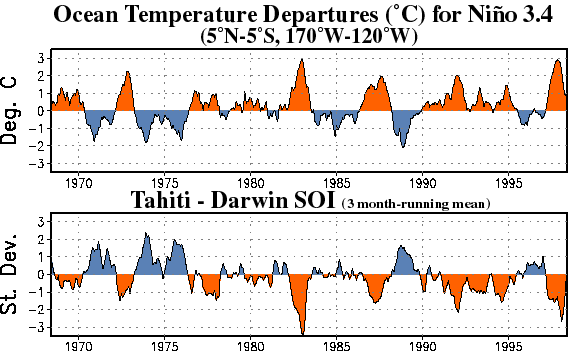
When the Niño 3.4 index is positive, the SOI tends to be negative, and vice versa!
It might be fun to explore precisely how well correlated they are. You can get the data to do that by clicking on the links above.
But here’s another question: how similar are the air pressure anomalies in Darwin and in Tahiti? Do we really need to take their difference, or are they so strongly anticorrelated that either one would be enough to detect an El Niño?
You can get the data to answer such questions here:
• Southern Oscillation Index based upon annual standardization, Climate Analysis Section, NCAR/UCAR. This includes links to monthly sea level pressure anomalies in Darwin and Tahiti, in either ASCII format (click the second two links) or netCDF format (click the first one and read the explanation).
In fact this website has some nice graphs already made, which I might as well show you! Here’s the SOI and also the sum of the air pressure anomalies in Darwin and Tahiti, normalized in some way:
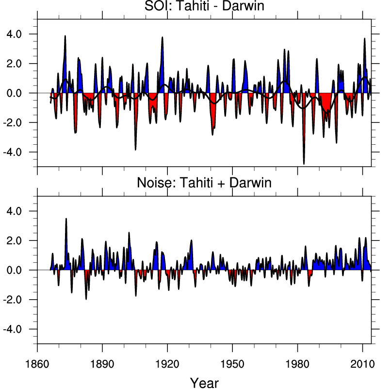
(Click to enlarge.)
If the sum were zero, the air pressure anomalies in Darwin and Tahiti would contain the same information and life would be simple. But it’s not!
How similar in character are the air pressure anomalies in Darwin and Tahiti? There are many ways to study this question. Dara tackled it by taking the air pressure anomaly data from 1866 to 2012 and computing some ‘continuous wavelet transforms’ of these air pressure anomalies. This is a good excuse for explaining how a continuous wavelet transform works.
Very basic statistics
It helps to start with some very basic statistics. Suppose you have a list of numbers
You probably know how to take their mean, or average. People often write this with angle brackets:

You can also calculate the mean of their squares:

If you were naive you might think 

and they’re equal only if all the 

is called the variance; it says how spread out our numbers are. The square root of the variance is the standard deviation:

and this has the slight advantage that if you multiply all the numbers 


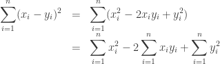
We can generalize the variance to a situation where we have two lists of numbers:
Namely, we can form the covariance

This reduces to the variance when 


For example, if

then they ‘vary hand in hand’, and the covariance

is positive. But if

then one is positive when the other is negative, so the covariance

is negative.
Of course the covariance will get bigger if we multiply both

which will always be between 

For example, if we compute the correlation between the air pressure anomalies at Darwin and Tahiti, measured monthly from 1866 to 2012, we get
-0.253727. This indicates that when one goes up, the other tends to go down. But since we’re not getting -1, it means they’re not completely locked into a linear relationship where one is some negative number times the other.
Okay, we’re almost ready for continuous wavelet transforms! Here is the main thing we need to know. If the mean of either

So, this quantity says how much the numbers 
We can do something similar if 


This is called the inner product of the functions 

Continuous wavelet transforms
What are continuous wavelet transforms, and why should we care?
People have lots of tricks for studying ‘signals’, like series of numbers 
Sines and cosines are great, but we might want to look for other patterns in a signal. A ‘continuous wavelet transform’ lets us scan a signal for appearances of a given pattern at different times and also at different time scales: a pattern could go by quickly, or in a stretched out slow way.
To implement the continuous wavelet transform, we need a signal and a pattern to look for. The signal could be a function 
Here’s an example of a wavelet:
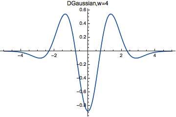
If we’re in a relaxed mood, we could call any function that looks like a bump with wiggles in it a wavelet. There are lots of famous wavelets, but this particular one is the fourth derivative of a certain Gaussian. Mathematica calls this particular wavelet DGaussianWavelet[4], and you can look up the formula under ‘Details’ on their webpage.
However, the exact formula doesn’t matter at all now! If we call this wavelet

As we saw in the last section, this fact lets us take our function
Loosely speaking, this measures the ‘amount of
Our wavelet 


We could also be interested in measuring the amount of some stretched-out or squashed version of a 

When 

Finally, we can combine these ideas, and compute

This is a function of the shift 
Mathematica implements this idea for time series, meaning lists of numbers 


and so on, where 

The factor of 


The results
Dara Shayda started with the air pressure anomaly at Darwin and Tahiti, measured monthly from 1866 to 2012. Taking DGaussianWavelet[4] as his wavelet, he computed the continuous wavelet transform 

This is a 2-dimensional color plot showing roughly how big the continuous wavelet transform 
Tahiti gave this:

You’ll notice that the patterns at Darwin and Tahiti are similar in character, but notably different in detail. For example, the red spots, where our chosen wavelet shows up strongly with period of order ~100 months, occur at different times.
Puzzle 1. What is the meaning of the ‘spikes’ in these scalograms? What sort of signal would give a spike of this sort?
Puzzle 2. Do a Gabor transform, also known as a ‘windowed Fourier transform’, of the same data. Blake Pollard explained the Gabor transform in his article Milankovitch vs the Ice Ages. This is a way to see how much a signal wiggles at a given frequency at a given time: we multiply the signal by a shifted Gaussian and then takes its Fourier transform.
Puzzle 3. Read about continuous wavelet transforms. If we want to reconstruct our signal

In fact we want a somewhat stronger condition, which is implied by the above equation when the Fourier transform of
• Continuous wavelet transform, Wikipedia.
Another way to understand correlations
David Tweed mentioned another approach from signal processing to understanding the quantity
If we’ve got two lists of data

(This can be achieved by dividing each list by its standard deviation, which is equivalent to what was done in the main derivation above.) Once we’ve done that then it’s clear that looking at

gives small values when they have a very good match and progressively bigger values as they become less similar. Observe that
Since we’ve scaled things so that 


becomes smaller. So,

serves as a measure of how close the lists are, under these assumptions.


Looking at the scalograms for Tahiti the big oddity for me is the way that there are 5 lots of really high power at high periods at the start of the observation period (between 1950ish and 1966ish) that seem to be almost regular that then never get close to that sort of power. What was the “long-term weather” like in Tahiti at that point? Was it markedly different to what it’s been like since?
Let’s start by all taking a closer look at that Tahiti scalogram:
The data go back to 1866, so the 5 peaks are in the period roughly 1866-1886.
Thanks for spotting that Graham; it hadn’t properly registered that this was different data to the one being used for the main El Nino analysis.
I should have said what time period was under study: 1866 to 2012. I’ve added that information to the post.
High coefficients mean that a period of ~100 month are strong at that point in time, but not so strong at later points in time. If you look at the smoothed SO time series (which means high frequencies are filtered out), there really seems to be some similarity, if you take the first 8-10 years and shift it to the right and compare it to the second period. If you try this later on, this does not work as well as in the first two periods.
Yes, I was wondering if that scalogram pattern led to some obvious characteristic of Tahiti’s weather over that periodm but my web search skills aren’t good enough to zero in on any historical accounts that are all simultaneously about Tahiti, weather and late 1800’s :-(
Reblogged this on sainsfilteknologi and commented:
Climate
Nice time-phase portraits, Dara and John!
Dave Tweed’s observation is the basis for a kind of signals analysis which is based upon coherence ideas. To see that, suppose is very large so
  and
and  are very well sampled. In that instance, and assuming
  and
and  are standardized in the way suggested, a big $latex $ means that
  and
and  are strongly related, and that’s true, even without knowing what
  and
and  represent. While there are subtleties and assumptions, as there always are, this is part of the “magic” behind Google correlate.
Here’s another connection … Let
Then
where, as from the blog post above,
Suppose there’s an application where we want to be very small. Well, if, given
  we could pick
  so
so ![\text{COV}[X,Y]](https://s0.wp.com/latex.php?latex=%5Ctext%7BCOV%7D%5BX%2CY%5D&bg=ffffff&fg=333333&s=0&c=20201002) was negative, that would help. In fact, there’s a trick, antithetic sampling for doing just that. (It’s also sometimes called a method of antithetic variates.) Here’s one application.
was negative, that would help. In fact, there’s a trick, antithetic sampling for doing just that. (It’s also sometimes called a method of antithetic variates.) Here’s one application.
Let be uniformly distributed on
 ![[0,1]](https://s0.wp.com/latex.php?latex=%5B0%2C1%5D&bg=ffffff&fg=333333&s=0&c=20201002) . Generate
. Generate  from that, and then pick
  to form
  . Then
  is also a uniform on
 ![[0,1]](https://s0.wp.com/latex.php?latex=%5B0%2C1%5D&bg=ffffff&fg=333333&s=0&c=20201002) but it is negatively correlated with
but it is negatively correlated with  . (Prove it.) This can be useful for variance reduction in applications. One is univariate numerical integration of monotonic functions. There are others. And, more usefully, it opens the question of how to go about doing variance reduction in other ways. One is stratified sampling which has applications not only in numerical integration, but also in survey sampling, and sampling from populations.
Thanks for some interesting links. I probably ought to mention that where I know the “trick” for showing sum of squared differences essentially the same as correlation is a lot more mundane, namely if you want to compute lots of “match scores” for various temporal delays, for correlations you can do this more efficiently ( ) via the Fourier domain than doing it directly (
 ). This gets to be significant when searching for large target signals within other very large signals.
I did something like that to implement Ludescher et al’s method:
http://www.azimuthproject.org/azimuth/show/Experiments+in+El+Ni%C3%B1o+analysis+and+prediction+#note_on_efficient_implementation
Typo: “and read means very large.”
Whoops! I’ll fix it, thanks.
And thanks for the edits of my comment, John. I should know better by now than to try to post comments with a lot of math here without running them across at my WordPress in private first. Sorry. Will endeavor in future.
It’s no big deal. My dad was an editor, I kinda like the business of making things look nice.
Re: Puzzle 1
What do you mean with “spikes”? The area of high coefficients or the green spikes at the top?
Well I am very new to Wavelet transforms, and have just skimmed through “The Continuous Wavelet Transform: A Primer” by Louis Arguiar-Conraria and Maria Joana Soares (available from ResearchGate). They mention of “Cross Wavelet” and “Cross Wavelet Power”. Would these be good tools to analyze this timeseries, e.g. with an offset?
John and Dara gave the puzzle, “Read about continuous wavelet transforms”
Is this a 1/f process? Wavelets, spectrum analysis and 1/f processes
I read today of an evaluation of the El Nino Southern Oscillation on a 10.000 years period using the measure of oxygen isotopes in the layers of clam shells.
I think that can be interesting to extend the wavelet transform.
The reference is
http://phys.org/news/2014-08-clam-fossils-year-history-el.html