guest post by Steven Wenner
Hi, I’m Steve Wenner.
I’m an industrial statistician with over 40 years of experience in a wide range applications (quality, reliability, product development, consumer research, biostatistics); but, somehow, time series only rarely crossed my path. Currently I’m working for a large consumer products company.
My undergraduate degree is in physics, and I also have a master’s in pure math. I never could reconcile how physicists used math (explain that Dirac delta function to me again in math terms? Heaviside calculus? On the other hand, I thought category theory was abstract nonsense until John showed me otherwise!). Anyway, I had to admit that I lacked the talent to pursue pure math or theoretical physics, so I became a statistician. I never regretted it—statistics has provided a very interesting and intellectually challenging career.
I got interested in Ludescher et al’s paper on El Niño prediction by reading Part 3 of this series. I have no expertise in climate science, except for an intense interest in the subject as a concerned citizen. So, I won’t talk about things like how Ludescher et al use a nonstandard definition of ‘El Niño’—that’s a topic for another time. Instead, I’ll look at some statistical aspects of their paper:
• Josef Ludescher, Avi Gozolchiani, Mikhail I. Bogachev, Armin Bunde, Shlomo Havlin, and Hans Joachim Schellnhuber, Very early warning of next El Niño, Proceedings of the National Academy of Sciences, February 2014. (Click title for free version, journal name for official version.)
Analysis
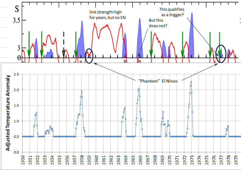
I downloaded the NOAA adjusted monthly temperature anomaly data and compared the El Niño periods with the charts in this paper. I found what appear to be two errors (“phantom” El Niños) and noted some interesting situations. Some of these are annotated on the images below. Click to enlarge them:

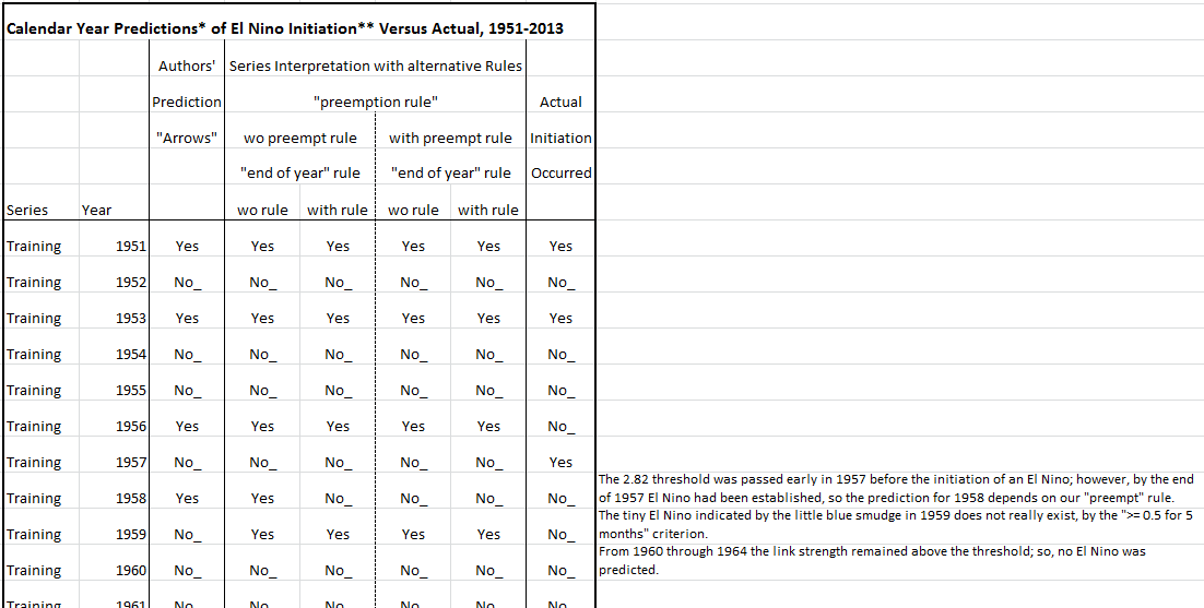
I also listed for each year whether an El Niño initiation was predicted, or not, and whether one actually happened. I did the predictions five ways: first, I listed the author’s “arrows” as they appeared on their charts, and then I tried to match their predictions by following in turn four sets of rules. Nevertheless, I could not come up with any detailed rules that exactly reproduced the author’s results.
These were the rules I used:
An El Niño initiation is predicted for a calendar year if during the preceding year the average link strength crossed above the 2.82 threshold. However, we could also invoke additional requirements. Two possibilities are:
1. Preemption rule: the prediction of a new El Niño is canceled if the preceding year ends in an El Niño period.
2. End-of-year rule: the link strength must be above 2.82 at year’s end.
I counted the predictions using all four combinations of these two rules and compared the results to the arrows on the charts.
I defined an “El Niño initiation month” to be a month where the monthly average adjusted temperature anomaly rises up to at least 0.5 C and remains above or equal to 0.5 °C for at least five months. Note that the NOAA El Niño monthly temperature estimates are rounded to hundredths; and, on occasion, the anomaly is reported as exactly 0.5 °C. I found slightly better agreement with the authors’ El Niño periods if I counted an anomaly of exactly 0.5 °C as satisfying the threshold criterion, instead of using the strictly “greater than” condition.
Anyway, I did some formal hypothesis testing and estimation under all five scenarios. The good news is that under most scenarios the prediction method gave better results than merely guessing. (But, I wonder how many things the authors tried before they settled on their final method? Also, did they do all their work on the learning series, and then only at the end check the validation series—or were they checking both as they went about their investigations?)
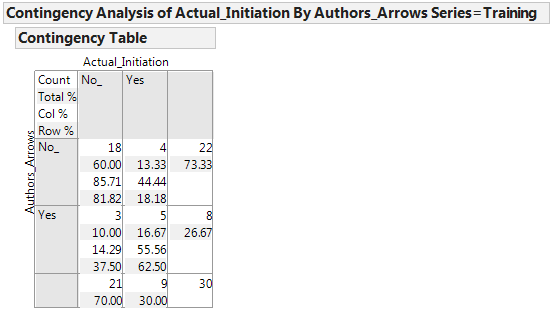
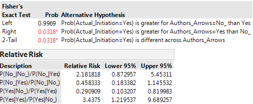
The bad news is that the predictions varied with the method, and the methods were rather weak. For instance, in the training series there were 9 El Niño periods in 30 years; the authors’ rules (whatever they were, exactly) found five of the nine. At the same time, they had three false alarms in the 21 years that did not have an El Niño initiated.
I used Fisher’s exact test to compute some p-values. Suppose (as our ‘null hypothesis’) that Ludescher et al’s method does not improve the odds of a successful prediction of an El Nino initiation. What’s the probability of that method getting at least as many predictions right just by chance? Answer: 0.032 – this is marginally more significant than the conventional 1 in 20 chance that is the usual threshold for rejecting a null hypothesis, but still not terribly convincing. This was, by the way, the most significant of the five p-values for the alternative rule sets applied to the learning series.
I also computed the “relative risk” statistics for all scenarios; for instance, we are more than three times as likely to see an El Niño initiation if Ludescher et al predict one, than if they predict otherwise (the 90% confidence interval for that ratio is 1.2 to 9.7, with the point estimate 3.4). Here is a screen shot of some statistics for that case:
Here is a screen shot of part of the spreadsheet list I made. In the margin on the right I made comments about special situations of interest.
Again, click to enlarge—but my whole working spreadsheet is available with more details for anyone who wishes to see it. I did the statistical analysis with a program called JMP, a product of the SAS corporation.
My overall impression from all this is that Ludescher et al are suggesting a somewhat arbitrary (and not particularly well-defined) method for revealing the relationship between link strength and El Niño initiation, if, indeed, a relationship exists. Slight variations in the interpretation of their criteria and slight variations in the data result in appreciably different predictions. I wonder if there are better ways to analyze these two correlated time series.


Are you in touch with Ludescher et al? It would be interesting to hear their response to your points.
Nadja Kutz contacted them about the issue mentioned in the section “Mathematical nuances” in Part 3, before that blog article came out. She never heard back. I suppose we should give them another try now.
Eventually some of us may try to publish a paper on this subject.
I have documented my reservations regarding the contingency table part of this analysis and its interpretation separately.
I also would be more comfortable about the communication if the findings if the heading reporting the Fisher Exact said “p-value” instead of “Prob”
This is very interesting and impressive stuff you’ve all been working on; I’m sorry I’m not in a position to help out much at the moment.
Anyway, one thing that would be interesting is, since it’s about predicting a binary event over a relatively small time series, it should be possible to compute all the Θ values where the classifier gets a different score on the training set. I do start to wonder if the 2.82 value is far below the Θ value with the next lowest score then I’d take this as a suggestion that the precise 2.82 value is significantly overfitting to the accommodate the weakest El Nino events in what’s a relatively small dataset. If it looks like a more even progression of “score changepoints” as Θ rises from 2.82 then that suggests its a more robust threshold.
We would be happy to have as much or little help as you can give. I’m thinking of taking our work and turning it into a publishable paper at some stage. If so, everyone who wants to help out is welcome to do so, and some subset can be coauthors, and everyone else will be thanked, and nobody has to do more work than they want—except, I guess, me.
So what about the sensitivity of Ludescher et al’s work on their choice of θ, and the danger of overfitting?
For what it’s worth, in their 2014 paper Ludescher et al write:
The reference (31) is to their earlier paper, which has this chart:
(Click to enlarge.)
They write:
Figure 2B is one we’ve already seen repeatedly; it’s the second part here:
I don’t deeply understand their discussion, since I don’t know what “receiver operating characteristic” analysis is, or the point of “reshuffling” the data. (Reshuffling something makes it sound like you’re testing to see if your predictions do better than completely random predictions, but you can do a lot better than random and still be really bad.)
Thanks. The quick upshot is that it sounds like Θ=2.8-ish is more robust than it looked from the graphs.
Incidentally, the simplest part of Receiver Operating Characteristic analysis is just an expansion of the idea that when comparing classifiers in a system doing binary prediction there’s two kinds of error: false positives and false negatives, and a learning procedure can often trade off between the two so there’s not one number that represents accuracy but a curve. If you plot, say, hit rate (ie true positive rate) vs false positive rate then you get a curve that should have a shape similar-ish to an upper-right quadrant of a circle.
When comparing different classifiers you often don’t know what the precise (false-positive, false-negative) you’ll want in deployment, but comparing the ROC curves you’ll often find that one classifier is “outermost” on the graph, and hence better, for a wide range of (false positive, false negative) values. (If you’re really lucky there’s one classifier that’s outermost for all the values, in which case it’s always the best classifier.) This is difficult to describe in words rather than with a diagram like this plot of some ROC curves from Wikipedia’s ROC article.
Ugh, that’s is why I hate trying to describe this in words. I meant the ROC curve is “upper left quadrant of a circle” (a shape like a letter but with a lot more steps.).
Thanks, I think I get it! I don’t care much about left versus right, since I’m left-handed and the distinction is arbitrary. But now I get why Ludescher et al are graphing the “hit rate” versus the “false alarm rate”. Before it was a complete mystery to me; now it makes perfect sense. I guess they get a reflected version of the “false positive” versus “false negative” graph you describe.
It’s conventional in ROC analysis to have “a quantity you want to maximise, generally the true positive rate” on the vertical -axis and “a quantity you want to minimise, generally the false positive rate” on the horizontal
  -axis, so that above or to the left corresponds to “better”. As you can probably tell, I find this mixed convention confuses me so always end up thinking about what should be happening in terms of two “errors that should be minimised”, ie, false positive and false negatives, and then convert that statement into a statement in terms of the ROC curve variables.
Hypergeometric wrote:
Let me show people here what you did:
Thanks so much, John! Steve concludes the same as I that the contingency table analysis supports the basic correctness of Ludescher, et al algorithm, but he’s underwhelmed by the significance of the p-value, and I say the Bayes analysis shows a sharper conclusion needs more time and more El Niño instances. I suspect, but have not done and so do not know, that a frequentist analysis of statistical power would show the same thing.
Hypergeometric wrote:
Steve Wenner was reporting significance test p-values. The word “probability” was part of an explanation introduced by me, because I think many readers here will not understand the phrase “Fischer exact test p-value”. Steve Wenner polished my explanation, and I think it’s correct:
That number is the p-value. Of course this explanation is a bit rough; the link provides a more detailed one… but I think it’s clear enough that a mathematician could reinvent the Fisher exact p-test starting from this description. (I know I could.)
I completely defer to the experts on how happy or unhappy I should be about a p-value of 0.032, whether the Fisher exact p-test is the best thing to be doing here, and what might be better. I wish I understood all the tests you ran! If I/we ever write a paper about the work of Ludescher et al, or some other El Niño prediction algorithm of our own, that would give me a great excuse to learn about these tests.
My dream would be something like this. Simplify Ludescher et al’s method without making it work any less well (we already know some ways to do that). Use it to make predictions starting not just from surface air temperatures but from ocean temperatures, which may be more important. Try a number of variations. Use really good statistical techniques to rate these different variations. Also use the same techniques to rate some of the standard methods of predicting El Niños.
(Nonexperts should always remember that this “climate network” method is very unusual and not what most meteorologists would want to use! So, it will be interesting to see how it compares.)
Well, I said I would defer to experts about whether the Fisher exact p-test is the best thing to be doing here, but that’s not quite true. When I’m evaluating a weather forecast, my main concern is not the p-value: I’m willing to concede immediately that the weather forecast is significantly better than a “random” one of some sort, so I won’t be happier being told there’s a 99.999% chance that the weatherman is doing better than random.
My main concern is “how good” the forecast is. But this concept requires further clarification; it’s actually a bunch of different concepts rolled into one. Some of the other tests you and Steve ran seem more like measures of “how good” Ludescher et al’s forecast is.
(Did not see your later comments ’til I put in my previous reply.)
In many respects the Fisher Exact and the Bayesian posteriors are comparable. They give similar results. BUT where the Fisher Exact gives p-values and odds ratios and confidence intervals for them based on some dubious assumptions, the Bayesian integration (and it does derive from calculating integrals, albeit numerically) gives full marginal posteriors for these relaxing all those assumptions. Each is just done using the integral form of Bayes Rule with the kernel of the integral being a likelihood expression for the data assuming a Poisson model of counts for each cell, conditioned on parameters of actual cell probabilities AND on values for the margins of the 2×2 treated as random parameters. These are assigned exponential priors, with their exponents being linear expressions of row only terms, of column only terms, and if cross terms. The terms have parameters to which uninformative hyperpriors are assigned. (I could write the math but I’m limited to my Kindle for the moment and that’s painful enough.) This gets rolled into separate big expectation calculations which produce, e.g., the posterior estimates of the cell counts.
It’s almost harder to describe than do. The Markov Chain model, given the model structure and data, “becomes” the various posteriors because of the Rosenbluth-Hastings theorem, and, once checked for convergence, offers samples from each of these posteriors to plot, calculate with, predict, etc.
Thanks for the clarification. My concern is the casual reader will misinterpret “probability” to mean “likelihood”, and “p-value” is at least something they’ll need to look up.
Moreover, my broader concern is conceptual, not only because only the Bayesian approach gives the full picture, but because the arguments suggest p-values are an index to plausibility, that if somehow, the smaller they are, the more plausible the Ludescher, et al, test of accuracy.. This is quite incorrect, even from a frequentist perspective. P-values, like it or no, are random variables, and a properly done frequentist significance test has the student of the problem establish a cutoff for acceptance based upon determined test specificity, power, and effect size, BEFORE the p-value is calculated, then drawing an unambiguous conclusion based upon the threshold.
It is also particularly noxious, in my opinion, to do something which Steve Wenner DID NOT, but Fyfe, Gillett, and Zwiers, for example, from “Warming Slowdown?” definitely did, which was to I interpret a p-value as an event probability and claim it equivalent to a random excursion happening once every so many years.
I’m not being pedantic about this. I”m trying to circumscribe bad frequentist practice. Doing things a Bayesian way is one way of doing that. Keeping to the narrow interpretations of frequentist p-values is another.
Oh my gosh, in little more time than it took me to fly across the Atlantic my guest post acquired quite a string of expert comments!
I agree completely with Hypergeometric’s criticisms and concerns about the assumption of fixed marginals in the Fisher exact test. I am really a Bayesian at heart and actually prefer Hypergeometric’s philosophy and analytical approach to my own frequentist analysis. I must point out, however, that the Bayesian approach does not reduce our list of assumptions – as you can see from Hypergeometric’s technical notes, the list of assumptions necessary to perform a Bayesian analysis is very long! (Hypergeometric – could you chart cumulative probabilities, instead of or in addition to densities? And with grid lines? I think that would help us in extracting more information).
I’m not sure I share Hypergeometric’s concern over the interpretation of p-values in my post. I do think we can use p-values as a measure of the credibility of a null hypothesis: if the p-value is very small then we are compelled to discard the null hypothesis (that doesn’t mean that any one particular alternative hypothesis is necessarily valid or useful!). Of course, in the broad Bayesian perspective p-values are random variables, but I don’t think that invalidates all frequentist interpretations.
A comment about (my attitude toward) null hypotheses: except in rare circumstances null hypothses are always false, and we don’t need any data to confirm that! The only issue is the size of an effect and its direction. So, does Ludesher et al’s approach help or hurt? I think there is weak evidence that it might help a little.
Thanks, Steve.
The notes were provided to support repeatability of result, and to provide minimal documentation of the cited code.
As far as assumptions go, the only serious one is of Poisson counts. That is, the distribution could be under- or overdispersed, something that could be checked by trying an alternative negative binomial model. But that, in my opinion, would be silly. There are only 30 damn events! It could be done, though.
I’ve promised JohnB I’ll (eventually) provide gory details of the analysis, not that it requires them, but in the form of an explanatory tutorial, my blog.
This all does suggest some thought should be given to how anyone’s going to be able to tell if an Azimuth-derived improvement is actually an improvement over Ludescher, et al. I’m not saying they can’t. I!m saying it should be given some thought, and perhaps some of us more test engineering-oriented people should invest in that.
The output presented is standard Coda diagnostics and results for MCMC/Gibbs samplers as is accepted. Next time I cook something there, I’ll think about doing it with cumulatives and then adding a grid to that.
Tuning out … Back to work problems and to sea-level rise. It’s been fun.
“null hypothses are always false” – from a Bayesian viewpoint, this is usually true except for a set of measure zero (or, “almost everywhere”, as a probabilist might say.
Steve wrote “…my whole working spreadsheet is available with more details for anyone who wishes to see it.” But I get the Not Found page.(?)
Whoops! Thanks, I fixed it. You can find Steve Wenner’s spreadsheet here. The annotations are interesting.
(My link called the file “ElNinoTemps.xslx”, but it’s “ElNinoTemps.xlsx”.)
Steve wrote:
Right! You and Hypergeometric (= Jan Galkowski) already know this stuff… but since we have lots of non-statistician readers here, I urge them to read this great blog article:
• Tom Leinster, Fetishizin p-values, The n-Category Café, 23 September 2010.
For those too lazy to click the link, here’s the basic point:
So, I agree completely with Jan’s point:
And here’s a reason why it’s really worthwhile. The question “how good is this method of El Niño prediction” is not only important for the methods we come up with here at Azimuth. It’s also important for rating the methods the ‘big boys’ use!
Look at this huge range of predictions the ‘big boys’ are making:
Which of these models should we trust? That’s an important question.
Of course, the ‘big boys’ have also thought about this question:
• Anthony G. Barnston, Michael K. Tippett, Michelle L. L’Heureux,
Shuhua Li and David G. Dewitt, Skill of real-time seasonal ENSO model predictions during 2002-2011 — is our capability increasing?, Science and Technology Infusion Climate Bulletin, NOAA’s National Weather Service, 36th NOAA Annual Climate Diagnostics and Prediction Workshop, Fort Worth, TX, 3-6 October 2011.
So, we’d need to understand what they’re doing before we could do something better.
“Barnston et al.” Is interesting. It is disappointing that the newer models have improved so little, if at all, over the older ones. I was struck by the great difficulty the statistical models had overcoming the “northern spring predictability barrier”; I think I can see how this could happen with ARIMA models, since the lag terms might swing a model in the wrong direction during periods of transition (but this is pure speculation on my part – I wonder what the experts would say). Has anyone tried composite models – weighting more heavily the dynamical forecasts during the late spring, early summer months and relying more on the statistical models at other times?
El Niños are complicated: See http://dx.doi.org/10.1175/2008JCLI2309.1, and http://blogs.agu.org/wildwildscience/2014/08/11/growing-signs-coming-winter-colder-snowier-last/
Thanks. I would like to know (but couldn’t find it in the links) which El Nino events are judged EP-ENSO and which CP-ENSO. I have a hypothesis: Ludescher et al’s method is better at EPs than CPs.
“How many flavors of …?” http://journals.ametsoc.org/doi/abs/10.1175/JCLI-D-12-00649.1
In case you’re interested, here are the other parts of this series:
• El Niño project (part 1): basic introduction to El Niño and our project here.
• El Niño project (part 2): introduction to the physics of El Niño.
• El Niño project (part 3): summary of the work of Ludescher et al.
• El Niño project (part 4): how Graham Jones replicated the work by Ludescher et al, using software written in R.
• El Niño project (part 5): how to download R and use it to get files of climate data.
• El Niño project (part 6): Steve Wenner’s statistical analysis of the work of Ludescher et al.
• El Niño project (part 7): the definition of El Niño.
In the work by Ludescher et al that we’ve been looking at, they don’t feed all the daily time series values into their classifier but take the […]
Steve Wenner, a statistician helping the Azimuth Project, noted some ambiguities in Ludescher et al‘s El Niño prediction rules and disambiguated them in a number of ways. For each way he used Fischer’s exact test to compute the p-value of the null hypothesis that Ludescher et al‘s El Niño prediction does not improve the odds of a successful prediction of an El Niño.
In email Steve Wenner wrote:
He added: