Here are some notes for the second session of my seminar. They are shamelessly borrowed from these sources:
• Tim van Beek, Putting the Earth In a Box, Azimuth, 19 June 2011.
• Climate model, Azimuth Library.
Climate models
Though it’s not my central concern in this class, we should talk a little about climate models.
There are many levels of sophistication when it comes to climate models. It is wise to start with simple, not very realistic models before ascending to complicated, supposedly more realistic ones. This is true in every branch of math or physics: working with simple models gives you insights that are crucial for correctly handling more complicated models. You shouldn’t fly a fighter jet if you haven’t tried something simpler yet, like a bicycle: you’ll probably crash and burn.
As I mentioned last time, models in biology, ecology and climate science pose new challenges compared to models of the simpler systems that physicists like best. As Chris Lee emphasizes, biology inherently deals with ‘high data’ systems where the relevant information can rarely be captured in a few variables, or even a few field equations.
(Field theories involve infinitely many variables, but somehow the ones physicists like best allow us to make a small finite number of measurements and extract a prediction from them! It would be nice to understand this more formally. In quantum field theory, the ‘nice’ field theories are called ‘renormalizable’, but a similar issue shows up classically, as we’ll see in a second.)
The climate system is in part a system that feels like ‘physics’: the flow of air in the atmosphere and water in the ocean. But some of the equations here, for example the Navier–Stokes equations, are already ‘nasty’ by the standards of mathematical physics, since the existence of solutions over long periods of time has not been proved. This is related to ‘turbulence’, a process where information at one length scale can significantly affect information at another dramatically different length scale, making precise predictions difficult.
Climate prediction is, we hope and believe, somewhat insulated from the challenges of weather prediction: we can hope to know the average temperature of the Earth within a degree or two in 5 years even though we don’t know whether it will rain in Manhattan on October 8, 2017. But this hope is something that needs to be studied, not something we can take for granted.
On top of this, the climate is, quite crucially, a biological system. Plant and animal life really affects the climate, as well as being affected by it. So, for example, a really detailed climate model may have a portion specially devoted to the behavior of plankton in the Mediterranean. This means that climate models will never be as ‘neat and clean’ as physicists and mathematicians tend to want—at least, not if these models are trying to be truly realistic. And as I suggested last time, this general type of challenge—the challenge posed by biosystems too complex to precisely model—may ultimately push mathematics in very new directions.
I call this green mathematics, without claiming I know what it will be like. The term is mainly an incitement to think big. I wrote a little about it here.
However, being a bit of an old-fashioned mathematician myself, I’ll start by talking about some very simple climate models, gradually leading up to some interesting puzzles about the ‘ice ages’ or, more properly, ‘glacial cycles’ that have been pestering the Earth for the last 20 million years or so. First, though, let’s take a quick look at the hierarchy of different climate models.
Different kinds of climate models
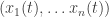
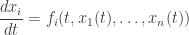
• Zero-dimensional models are like theories of classical mechanics instead of classical field theory. In other words, they only consider with globally averaged quantities, like the average temperature of the Earth, or perhaps regionally averaged quantities, like the average temperature of each ocean and each continent. This sounds silly, but it’s a great place to start. It amounts to dealing with finitely many variables depending on time:
We might assume these obey a differential equation, which we can always make first-order by introducing extra variables:
This kind of model is studied quite generally in the subject of dynamical systems theory.
In particular, energy balance models try to predict the average surface temperature of the Earth depending on the energy flow. Energy comes in from the Sun and is radiated to outer space by the Earth. What happens in between is modeled by averaged feedback equations.
The Earth has various approximately conserved quantities like the total amount of carbon, or oxygen, or nitrogen—radioactive decay creates and destroys these elements, but it’s pretty negligible in climate physics. So, these things move around from one form to another. We can imagine a model where some of our variables 
Here’s one described by Nathan Urban in “week304” of This Week’s Finds:

I’m interested in box models because they’re a simple example of ‘networked systems’: we’ve got boxes hooked up by wires, or pipes, and we can imagine a big complicated model formed by gluing together smaller models, attaching the wires from one to the wires of another. We can use category theory to formalize this. In category theory we’d call these smaller models ‘morphisms’, and the process of gluing them together is called ‘composing’ them. I’ll talk about this a lot more someday.
• One-dimensional models treat temperature and perhaps other quantities as a function of one spatial coordinate (in addition to time): for example, the altitude. This lets us include one dimensional processes of heat transport in the model, like radiation and (a very simplified model of) convection.
• Two-dimensional models treat temperature and other quantities as a function of two spatial coordinates (and time): for example, altitude and latitude. Alternatively, we could treat the atmosphere as a thin layer and think of temperature at some fixed altitude as a function of latitude and longitude!
• Three-dimensional models treat temperature and other quantities as a function of all three spatial coordinates. At this point we can, if we like, use the full-fledged Navier–Stokes equations to describe the motion of air in the atmosphere and water in the ocean. Needless to say, these models can become very complex and computation-intensive, depending on how many effects we want to take into account and at what resolution we wish to model the atmosphere and ocean.
General circulation models or GCMs try to model the circulation of the atmosphere and/or ocean.
Atmospheric GCMs or AGCMs model the atmosphere and typically contain a land-surface model, while imposing some boundary conditions describing sea surface temperatures. Oceanic GCMs or OGCMs model the ocean (with fluxes from the atmosphere imposed) and may or may not contain a sea ice model. Coupled atmosphere–ocean GCMs or AOGCMs do both atmosphere and ocean. These the basis for detailed predictions of future climate, such as are discussed by the Intergovernmental Panel on Climate Change, or IPCC.
• Backing down a bit, we can consider Earth models of intermediate complexity or EMICs. These might have a 3-dimensional atmosphere and a 2-dimensional ‘slab ocean’, or a 3d ocean and an energy-moisture balance atmosphere.
• Alternatively, we can consider regional circulation models or RCMs. These are limited-area models that can be run at higher resolution than the GCMs and are thus able to better represent fine-grained phenomena, including processes resulting from finer-scale topographic and land-surface features. Typically the regional atmospheric model is run while receiving lateral boundary condition inputs from a relatively-coarse resolution atmospheric analysis model or from the output of a GCM. As Michael Knap pointed out in class, there’s again something from network theory going on here: we are ‘gluing in’ the RCM into a ‘hole’ cut out of a GCM.
Modern GCMs as used in the 2007 IPCC report tended to run around 100-kilometer resolution. Individual clouds can only start to be resolved at about 10 kilometers or below. One way to deal with this is to take the output of higher resolution regional climate models and use it to adjust parameters, etcetera, in GCMs.
The hierarchy of climate models
The climate scientist Isaac Held has a great article about the hierarchy of climate models:
• Isaac Held, The gap between simulation and understanding in climate modeling, Bulletin of the American Meteorological Society (November 2005), 1609–1614.
In it, he writes:
The importance of such a hierarchy for climate modeling and studies of atmospheric and oceanic dynamics has often been emphasized. See, for example, Schneider and Dickinson (1974), and, especially, Hoskins (1983). But, despite notable exceptions in a few subfields, climate theory has not, in my opinion, been very successful at hierarchy construction. I do not mean to imply that important work has not been performed, of course, but only that the gap between comprehensive climate models and more idealized models has not been successfully closed.
Consider, by analogy, another field that must deal with exceedingly complex systems—molecular biology. How is it that biologists have made such dramatic and steady progress in sorting out the human genome and the interactions of the thousands of proteins of which we are constructed? Without doubt, one key has been that nature has provided us with a hierarchy of biological systems of increasing complexity that are amenable to experimental manipulation, ranging from bacteria to fruit fly to mouse to man. Furthermore, the nature of evolution assures us that much of what we learn from simpler organisms is directly relevant to deciphering the workings of their more complex relatives. What good fortune for biologists to be presented with precisely the kind of hierarchy needed to understand a complex system! Imagine how much progress would have been made if they were limited to studying man alone.
Unfortunately, Nature has not provided us with simpler climate systems that form such a beautiful hierarchy. Planetary atmospheres provide insights into the range of behaviors that are possible, but the known planetary atmospheres are few, and each has its own idiosyncrasies. Their study has connected to terrestrial climate theory on occasion, but the influence has not been systematic. Laboratory simulations of rotating and/or convecting fluids remain valuable and underutilized, but they cannot address our most complex problems. We are left with the necessity of constructing our own hierarchies of climate models.
Because nature has provided the biological hierarchy, it is much easier to focus the attention of biologists on a few representatives of the key evolutionary steps toward greater complexity. And, such a focus is central to success. If every molecular biologist had simply studied his or her own favorite bacterium or insect, rather than focusing so intensively on E. coli or Drosophila melanogaster, it is safe to assume that progress would have been far less rapid.
It is emblematic of our problem that studying the biological hierarchy is experimental science, while constructing and studying climate hierarchies is theoretical science. A biologist need not convince her colleagues that the model organism she is advocating for intensive study is well designed or well posed, but only that it fills an important niche in the hierarchy of complexity and that it is convenient for study. Climate theorists are faced with the difficult task of both constructing a hierarchy of models and somehow focusing the attention of the community on a few of these models so that our efforts accumulate efficiently. Even if one believes that one has defined the E. coli of climate models, it is difficult to energize (and fund) a significant number of researchers to take this model seriously and devote years to its study.
And yet, despite the extra burden of trying to create a consensus as to what the appropriate climate model hierarchies are, the construction of such hierarchies must, I believe, be a central goal of climate theory in the twenty-first century. There are no alternatives if we want to understand the climate system and our
comprehensive climate models. Our understanding will be embedded within these hierarchies.
It is possible that mathematicians, with a lot of training from climate scientists, have the sort of patience and delight in ‘study for study’s sake’ to study this hierarchy of models. Here’s one that Held calls ‘the fruit fly of climate models’:
For more, see:
• Isaac Held, The fruit fly of climate models.
The very simplest model
The very simplest model is a zero-dimensional energy balance model. In this model we treat the Earth as having just one degree of freedom—its temperature—and we treat it as a blackbody in equilibrium with the radiation coming from the Sun.
A black body is an object that perfectly absorbs and therefore also perfectly emits all electromagnetic radiation at all frequencies. Real bodies don’t have this property; instead, they absorb radiation at certain frequencies better than others, and some not at all. But there are materials that do come rather close to a black body. Usually one adds another assumption to the characterization of an ideal black body: namely, that the radiation is independent of the direction.
When the black body has a certain temperature 


Electromagnetic radiation comes in different wavelengths. So, can ask how much energy flux our black body emits per change in wavelength. This depends on the wavelength. We will call this the monochromatic energy flux 


Max Planck was able to calculate

where 


You can integrate 

then in fact we can do the integral and get

for some constant 


Using this formula, we can assign to every energy flux
Let’s use this to calculate the temperature of the Earth in this simple model! A planet like Earth gets energy from the Sun and loses energy by radiating to space. Since the Earth sits in empty space, these two processes are the only relevant ones that describe the energy flow.
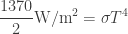
The sunshine near Earth carries an energy flux of about 1370 watts per square meter. If the temperature of the Earth is constant, as much energy is coming in as going out. So, we might try to balance the incoming energy flux with the outgoing flux of a blackbody at temperature 

and then solve for

We’re making a big mistake here. Do you see what it is? But let’s go ahead and see what we get. As mentioned, the Stefan–Boltzmann constant has a value of

so we get

This is much too hot! Remember, this temperature is in kelvin, so we need to subtract 273 to get Celsius. Doing so, we get a temperature of 121 °C. This is above the boiling point of water!
Do you see what we did wrong? We neglected a phenomenon known as night. The Earth emits infrared radiation in all directions, but it only absorbs sunlight on the daytime side. Our calculation would be correct if the Earth were a flat disk of perfectly black stuff facing the Sun and perfectly insulated on the back so that it could only emit infrared radiation over the same area that absorbs sunlight! But in fact emission takes place over a larger area than absorption. This makes the Earth cooler.
To get the right answer, we need to take into account the fact that the Earth is round. But just for fun, let’s see how well a flat Earth theory does. A few climate skeptics may even believe this theory. Suppose the Earth were a flat disk of radius 

since the area of the disk is 

since it emits from both the front and back. Setting these equal, we now get
or

This reduces the temperature by a factor of 

But this is still too hot! It’s 58 °C, or 136 °F for you Americans out there who don’t have a good intuition for Celsius.
So, a flat black Earth facing the Sun would be a very hot Earth.
But now let’s stop goofing around and do the calculation with a round Earth. Now it absorbs a beam of sunlight with area equal to its cross-section, a circle of area 


so the temperature is reduced by a further factor of 

That’s 6 °C. Not bad for a crude approximation! Amusingly, it’s crucial that the area of a sphere is 4 times the area of a circle of the same radius. The question if there is some deeper reason for this simple relation was posed as a geometry puzzle here on Azimuth.
I hope my clowning around hasn’t distracted you from the main point. On average our simplified blackbody Earth absorbs 1370/4 = 342.5 watts of solar power per square meter. So, that’s how much infrared radiation it has to emit. If you can imagine how much heat a 60-watt bulb puts out when it’s surrounded by black paper, we’re saying our simplified Earth emits about 6 times that heat per square meter.
The second simplest climate model
The next step is to take into account the ‘albedo’ of the Earth. The albedo is the fraction of radiation that is instantly reflected without being absorbed. The albedo of a surface does depend on the material of the surface, and in particular on the wavelength of the radiation, of course. But in a first approximation for the average albedo of earth we can take:

This means that 30% of the radiation is instantly reflected and only 70% contributes to heating earth. So, instead of getting heated by an average of 342.5 watts per square meter of sunlight, let’s assume it’s heated by

watts per square meter. Now we get a temperature of

This is -18 °C. The average temperature of earth is actually estimated to be considerably warmer: about +15 °C. This should not be a surprise: after all, 70% of the planet is covered by liquid water! This is an indication that the average temperature is most probably not below the freezing point of water.
So, our new ‘improved’ calculation gives a worse agreement with reality. The actual Earth is roughly 33 kelvin warmer than our model Earth! What’s wrong?
The main explanation for the discrepancy seems to be: our model Earth doesn’t have an atmosphere yet! Thanks in part to greenhouse gases like water vapor and carbon dioxide, sunlight at visible frequencies can get into the atmosphere more easily than infrared radiation can get out. This warms the Earth. This, in a nutshell, is why dumping a lot of extra carbon dioxide into the air can change our climate. But of course we’ll need to turn to more detailed models, or experimental data, to see how strong this effect is.
Besides the greenhouse effect, there are many other things our ultra-simplified model leaves out: everything associated to the atmosphere and oceans, such as weather, clouds, the altitude-dependence of the temperature of the atmosphere… and also the way the albedo of the Earth depends on location and even on temperature and other factors. There is much much more to say about all this… but not today!


One other thing you could take away from this is that it’s very difficult to know when to stop calculating. We could have added in new terms to better approximate reality until we got a number that roughly agreed with the right answer and then declared our calculation to be a brilliant success. As we add more terms, the agreement actually gets better and worse. And with a complicated system like the Earth, there will always be many more terms that we could add!
An unscrupulous actor could cook up a seemingly reasonable model that will produce a biased result or criticize an unbiased model for omitting terms that would bias the model in a favored direction.
It’s vital to think really hard about our systematic uncertainties and how to clearly communicate them even to an educated audience.
X wrote:
Right. The usual solution to this is the scientific method: establishing a community where career advancement relies on convincing everyone else that you’re really working hard to understand the subject, not just pushing an agenda… and everyone in the community can score points by spotting errors in each other’s work. It’s imperfect but it’s the best thing we’ve got. Mistakes get made but they eventually get sorted out. But with climate change, the stakes are so high that lots of people outside the relevant community and uncommitted to the scientific method are getting involved…
…and ‘eventually’ may be too late.
This is a rather subjective feeling but I find that not only within climate science but in general that the academic landscape has changed quite rapidly in something like the last ten years. This may be in part be due to an increasing pressure to produce economically relevant results and/or due to the smaller availabilty of academic job positions, which are relatively safe in comparision to free market jobs.
…which are relatively safe in comparision to free market jobs… and/or due to the fact that overall the job competition got fiercer.
….where “economically relevant” is of course a very debateable term.
citation from IMFC Statement by Guy Ryder; Director-General, International Labour Organization; October 13, 2012 at
http://www.imf.org/external/am/2012/imfc/statement/eng/ilo.pdf
Note that while this is true, if the studied “thing” allows it the scientific method goes further and looks for predictions of new elements that can be validated. (Some subjects may have limited scope for this due to ethics, timescale, too big to duplicate, etc. but it should be striven for.) I’m very sceptical when someone takes some data and “explains” it without making new predictions, as I’ve seen too many cases where the model that “is clearly right” has matched existing data,then some “no-one thought we would be able to measure this” new/revised data comes along that it fails to match.
And it’s difficult to make an agenda model that works well for prediction, not just retrodiction.
That is most certainly NOT a scientific method. That is politics,
A scientific method is about empirical verification – using your model to make predictions about the outcomes of experiments and then performing those experiments and verifying results. Only if your model passes multiple experimental tests it can be considered reliable.
Of course I am well aware that scientific method is not very practical in the context of climate sciences (due to timescales involved and no ability to make controlled experiments) but that certainly doesn’t mean that political consensus can now somehow replace it in this context. It simply means that our current climate models are NOT trustworthy.
Incidentally the recent release of HadCRUT4 data which shows no warming trend during the last 16 years should make it obvious to everyone. Even Phil Jones is now forced to admit that models are not reliable as we don’t know how to model natural variability. And of course if one admits that natural variability could well mask supposed global warming on a timescale of decades one also admits the possibility that natural variability could in fact be responsible for most of the warming that was attributed to anthropogenic emissions in the first place.
http://www.dailymail.co.uk/sciencetech/article-2217286/Global-warming-stopped-16-years-ago-reveals-Met-Office-report-quietly-released–chart-prove-it.html
Are you under the impression that the recent temperature trend invalidates the representation of natural variability in climate models? You may want to consult Easterling and Wehner (2009) and Meehl et al. (2011).
Phil Jones is basically right: what we’ve seen over the last 15 years is on the low end of model predictions, but models can and do predict such “hiatus” periods, and 15 years isn’t really long enough to rule out one of these superimposed on the expected greenhouse warming trend. So it’s something climate scientists are keeping an eye on, but it’s not to the point of “disproving climate models” or anything like that.
This is a nonsensical statement. We know a lot of things about modeling natural variability. How well the models do at that depends, as usual, on the process and scale in question. (e.g., you will get different answers for ENSO, PDO, etc.) It would be interesting to know what Phil Jones actually said, and in context; I don’t find the Daily Mail to be a very reliable source.
You are confusing timescales. If we’d seen flat temperatures for 40 years, then yes, we’d have to say that there is a dominant component of natural variability. But we haven’t; we’ve seen warming. What we have seen in the last 15 years isn’t yet sufficient to attribute most of the preceding warming to natural variability. And, in fact, any such attribution would be problematic once you start looking past global average surface temperature as your only metric. For example, persistent natural temperature trends on the timescale of decades are generally related to ocean dynamics. But it is hard to explain warming at the surface due to a transfer of heat from the ocean, given that the ocean shows a pronounced top-down transfer of heat from the surface during that time.
PS. By your definition of scientific method church theologians would be scientists – they meet all the criteria.
My offhand remark was not intended as a full-fledged ‘definition’ of the scientific method. I agree that experiments are a key component of that method. It’s also true that setting up a system where people can advance their careers by finding mistakes in other people’s work is necessary for the scientific method to succeed. This is true to a limited extent in theology, but if a religion has unquestionable dogmas, e.g. the existence of god, it’s not going to advance your career to find mistakes in those. The same is true for other ‘-ologies’: if beliefs get taken as dogmas to the point where it’s career suicide to say they’re wrong even when you’re right, these disciplines will cease to be sciences in the best sense.
Dear Prof Baez,
Where’s the room for explicitly time dependent systems, ie those which are non autonomous? I’m talking about perhaps a time-periodic dynamical system, where the dynamic law changes as a function of time.
I’ll put some equations in to back up what I’m saying. For example, you treat the autonomous case:
but these aren’t the only dynamic systems that have explicit solutions. In fact, there is another class of differential equations, given by:
which, at least for the problems I am currently working on can be written as:
where the constraint (which I call F) is orthogonal to the system Hamiltonian:
(in matrix land, the dot product takes the form of trace distance).
Of course the total energy available to the system is bounded by some upper level:
I’ve calculated all the solutions to this system of equations up to dimension 4×4 and a few higher dimensional problems as well and generally I find that the system Hamiltonian is either periodic or constant.
Let me know if you’ve got anything to add to this, if you need some resources on this type of time dependent mechanics, waddle over to http://www.quantumtime.wikidot.com where I’ve been uploading a few files as a shared resource.
Yours,
P. G. Morrison BSc. MSc.
P. G. Morrison wrote:
They’re great too. My goal this quarter is eventually to talk about models of how the Milankovich cycles—quasiperiodic variations in the Earth’s orbit—may have caused the ice ages. That’s a non-autonomous system.
I’ll fix my differential equation which assumed an autonomous system.
Pardon my uncompiled equations, I didn’t realise I had to add a $latex in front of it, next time, I’ll get it right. You understand my point regardless
I fixed it. You also need a $ after the equation.
Would it be possible to check the calculation your did for an earth without atmosphere by doing it for some planet or moon where we happen to know all the relevant data. In other words, is there some heavenly object without atmosphere where we know (ideally by measurement) or can estimate size, flux, average albedo and average temperature?
That sounds fun! I imagine the Moon would be one the best studied objects without an atmosphere, though due to its slow (28-day) rotation period the temperature is very far from equilibrium: you’d need a dynamical model, not a static one as presented here, to do a good job.
The temperature would presumably be closer to constant on a rapidly tumbling small asteroid. I don’t know how well people have measured temperatures of asteroids, though.
I imagine the first step is to use Google and Google Scholar to track down some data.
I was thinking the same thing this morning. The albedo of the moon is less than the earth, according to http://www.asterism.org/tutorials/tut26-1.htm is .12.
So assuming the same sun input the calculation gives -3 C. Here are some data of Moon temperature http://www.universetoday.com/19623/temperature-of-the-moon/
They oscillate a lot because the large days and nights, from minus 153 at the end of the night to 107 at noon. The average (does this makes sense?) is then -23.
So probably the static model, as John said, is not very good but let me suggest another possible or at least partial explanation. The moon is saturated with craters so there is a lot of more area of emission than the effective area of reception.
Returning to Kelvin instead of 270 we have 250, the 20 degrees is a factor of .925. Solving
We obtain a nice explanation if the area of emission was 36% greater. Is the moon that saturated by craters?
i mean the quotient is .925.. sorry
Hi, Renato! This would be an interesting question to study.
It would be nice to see a graph of the temperature of one spot on the Moon as a function of time. What is a typical month like? That would give us a better way to understand the average temperature than just averaging the maximum and minimum temperature.
But since the power emitted by a blackbody goes as the fourth power of the absolute temperature, which is a nonlinear function, computing the power emitted by the Moon at its average temperature will give a different answer than computing the average power. And since the fourth power function is convex, your way of computing the power emitted gives an underestimate:
Maybe correcting this will help. The effect could be rather large since according to you the temperature ranges from 120 K to 380 K. That’s more than a factor of three! So if we naively compute the mean of these numbers and raise it to the fourth power, we’ll get something much smaller than raising them to the fourth power and then taking their mean.
But of course this nonlinearity means it’s even more important to know the whole graph of the Moon’s temperature, not just the maximum and minimum. Using just the max and min overstates the impact of the nonlinearity.
There is a nice graph of the moon temperature here
http://www.diviner.ucla.edu/science.shtml
As expected heavy day-night dependent.
For almost al altitudes the graph is season independent.
Night temperatures are almost altitude independent, day temperature do increase towards the equator.
In this page:
http://www.asi.org/adb/m/03/05/average-temperatures.html
I found the temperature for 1 meter below the surface:
-35 C. They claim it is independent of day night variations.
Hi John
I am a little bit confused. The simplest thing I can think is the following model
Is this correct? There are several thing that look fine but there is something that does not fit.
If the temperature is not constant, the variation is the difference of the input, in this case the sun, and the output, the radiation. Are there other things? If not we get the above differential equation.
If we assume $S$ independent of say
say  for example if we just take an average, we can look for the thermic equilibrium that is when
  is zero, and get as before
It is nice that this is asymptotic global stable equilibrium. Meaning that if we don’t start at this equilibrium we will converge towards it.
Now the moon is far from being in thermic equilibrium. So we use the complete equation. We still have to be more precise in saying who is $S(t)$. Simplifying to a period of 28 days we can assume something like
0 \mbox{ \hspace{2.6cm} if $14*A<t < 28*A$}
\end{cases}
$
The period begins at the morning, the power increases until a maximum at noon, seven days after, and at the end of the evening the sun and $S(t)$ disappears. Then we have 14 days of night with no sun- $S(t)=0$. $A$ is the number of seconds in a day.
Is we take time into account, the system is two dimensional, the forcing is periodic, and it is possible to show (using for example the Poincare Bendixson Theorem ) that there is a periodic orbit. I guess it should be unique and asymptotic stable. But what puzzles me is the night equation:
It can be exactly solved:
This formula gives the temperature after seconds if we started at temperature
  .
. at the end of the night is
  .
. at the end of the night the temperature will be
The numerical value for
So if we start in the beginning of the night with temperature
For typical , say bigger than 100,
  is very small compared with
  , and so the final temperature is essentially independent of
  . This is what we observed in the graphs, but the value is equal to
  which is an incredible low temperature. In the graphs we see something around 90 K. So something is wrong here. Either
I got the wrong model, I did a numerical mistake, or the model should take into account some other thing. Possibly a very thin atmosphere.
The formula in plain latex that did not upload.
$$S(t)= \begin{cases} S_0\sin (\frac{\pi}{14*A}t) \mbox{ \hspace{1cm} if $0<t < 14*A$} \\
0 \mbox{ \hspace{2.6cm} if $14*A<t < 28*A$}
\end{cases}
$$
Your formula is not dimensionally correct. The left-hand side has units of temperature per time, whereas the right-hand side has units of energy flux, i.e. energy per time (power) per area. What you’re missing is an effective heat capacity (per area) on the left-hand side, which controls how fast the surface of the Moon heats up.
Hi Nathan
I understand the mistake, Thank you. Fortunately if I have only to insert a constant to change the units, the mistake is easily corrected. But I am not sure how to get the constant. The heat capacity of what ever the moon is made off will allow to change Kelvin to Joules, this introduces a kilogram that we can change for cubic meters putting the density of the moon soil. But the units are still not correct, in one side we have per square meters in the other per cubic meters. I can raise the number (heat capacity*density) that I get on the left to the power
power
to get at least a scale invariant equation. But I am not sure if this is correct.
The heat capacity on the left hand side is really heat capacity per unit area. As for its value, it can be hard to derive from first principles. What you need to do is treat the Moon’s surface as having a certain “effective depth”, and then consider the bulk heat capacity of the lunar soil with that thickness. But the effective depth itself is chosen so the dynamics of the equation approximate a more complex equation such as the diffusive heat equation. In practice, people often start with data and empirically tune these coefficients rather than trying to calculate them directly. But as a check on the theory, you don’t really want to tune them.
I am not sure I understand completely what you are suggesting. Is it something like: We must think in layers, two neighborhood layers emit radiation the total net amount is the difference. When the with of the layer tends to zero we should get something like
Where is the heat capacity (Now we have the correct units). Then approximate
  by
by  where
where  is the effective depth. So
after evaluating we get the same ordinary differential equation
with a parameter to adjust.
I did not want to tune a constant but probably is not to bad if this recovers all the graphs in http://www.diviner.ucla.edu/science.shtml
and the effective depth is a reasonable value, say much less than a meter where the temperature is almost constant.
This reminds me when in hot summer day I run in the beach towards the sea and in the middle I stop to quickly dig a hole with the feet so they are at comfortable temperature. A couple of cm would be more than enough. So the question is how much I would have to dig if I am running in the moon.
By the way it I also wonder what does this has to do with the heat equation
The radiation effect is only non negligible when the difference of temperatures is big?
By the way, you’re noticing that it’s hard to compute the temperature of the Moon’s surface as a function of time starting from first principles. There’s something that should be easier to do: compute the power emitted by the Moon as a function of time, given its surface temperature as a function of time and assuming the Moon is close to a blackbody. Then, you could integrate this over a month and see if it equals the solar energy absorbed by the Moon during a month.
You could try to do this either for the whole Moon or, perhaps easier, for a square meter at the Moon’s equator.
This is what I originally thought you wanted to do: test the simplest possible energy balance model on a planet without an atmosphere. For a small rapidly tumbling asteroid we could perhaps treat the surface temperature as constant. For the Moon we can’t, but we can measure it and see if the calculated energy coming in equals the calculated energy going out. If it doesn’t, I’m confused about something.
Hi John
You are right lets do first the energy balance in a square meter in the equator, knowing the temperature. (1370) be the sun power per square meter, and
  be the number of seconds (1274400) in half a cycle (29.5 days) . If we start in the lunar morning the effective power as function of time should be something like

Let
So the received energy in a cycle is
 .
. . So a square meter in the equators moon receives
  Joules in a moon cycle.
Which is one of the few integrals I can do,
Now the for the emitted radiation, we have to interpret the graphs of the temperature in http://www.diviner.ucla.edu/science.shtml for the day and
  in the night.
The graph is very flat in the minimum, a consequence of the moon cooling down very quickly. To the resolution of my eyes looks that all night has roughly the minimum value.
So I propose to a first approximation
The emitted energy is then
This integral can be done but it is easier to evaluate in a online calculator . The second term, the night radiation, is of order
  so doesn’t change significantly the answer.
http://www.numberempire.com/ and gives
So the emitted radiation is only around of the received. We can push the minimum night to only 7 days and adjust the
  function to cover 22 days, which I think is way to much, and we would get then something around
  . Is this equal enough to not be confused?
Hi John
Here are some little codes of the day ( http://dl.dropbox.com/u/7915230/Luna/dia.rtf )and the night (http://dl.dropbox.com/u/7915230/Luna/noche.rtf )dynamics. They run in the demo version of “Berkeley Madonna” software.
The first one solves the equation
Where $H$ is the heat capacity, the density, and $d$ is the effective depth. Since apparently the moon is mostly silicates like sand, I choose the values for sand: 800
  and 2000
  . Also I thought 10 cm was a reasonable value for the effective depth. $\theta $ is the latitude (in radians),
  the full power of the sun (1370) and
  is the numbers of seconds in half of the moon cycle.
For the equator with an initial temperature of 50 degrees Kelvin we get
and for the same location but starting at 130 degrees
we get
What I find interesting is that it really doesn’t matter where at what temperature you start with, by noon you have a value very near the maximum thermodynamical equilibria for the full power of the sun. To change the final temperature we have to change of latitude , here is a graph at 45 degrees.

The night equation is simpler, it does not depend on the latitude
here is a graph starting the night at 220

and here is a graph starting the night at 150

Note that in the equation there is no 4 as I thought before, this is for two practical reasons and I would like to hear a good reason.
The first reason is that if I put here, I should put it also in the day equation. But then the maximum noon temperature would be much less than the observed one, in fact changing the value of the thermodynamical equilibrium. The other reason is that if a leave it I don’t get reasonable temperatures, in order to adjust to get reasonable temperatures I have to adjust the effective depth to something like 40 cm. Which for some reason I think is to much.
The following is nice: Let the composition of the two dynamics, a map from $[0,390 ]$ to itself. We start from some temperature and after 29.5 days we have another temperature. By elementary calculus -the mean value theorem- there is a fixed point, this fix point corresponds ti a periodic orbit. Moreover the transformation is a huge contraction, as we observed before more or less independently of the initial morning temperature we arrive near the maximum, the cooling is also contraction so there is only one fixed point, so the periodic orbit is an attractor.
There is something that still is not very well explained, the difference of the minimal temperature in each latitude is much smaller than the ones that appear in the graph of http://www.diviner.ucla.edu/science.shtml
I guess this has to do with with this effective depth not being quite right.
If it’s perfectly black, we saw last time that it emits light with a monochromatic energy flux given by the Planck distribution […]
To any experimental scientist, Isaac Held’s article must read as an argument against the validity of his field. For what he says is, in effect: because nature has not provided a profusion of climates for us to study, ranging from the simple to the complex, we must invent models of simpler climates and study them in hopes of gaining insight into the few and complex climates that do exist where we can observe. The problem with this procedure should be obvious; since no examples of simpler climates are available, there is no way to check the predictions of an invented model against real phenomena, and hence no grounds to believe that the model reflects reality. There are so many steps in the hierarchy between the airless planet in orbit and the actual situation of Earth, none of which can be observed, that the climate modelers will certainly become lost in baseless speculation long before they reach the level Earth is on.
Exactly the same problem appears in string theory – the string theorists have generated many questions of mathematical interest, but not even the most committed researcher in the field can claim they’ve made a prediction that can be tested by experiment. Thus we see Lee Smolin declaring the whole field to be not physics at all, and a dangerous diversion.
Of course, string theory hasn’t been used as the basis of a political program which claims massive changes to human society are necessary to save life on Earth, so the parallel between string theory and climate modeling is not complete. If you leave the politics out of it, though, the status of the fields as science is about the same.
Michael wrote:
I can’t make any sense of this statement. The point of a hierarchy of climate models is not to test the models against “simpler climates”, but to isolate important dynamics of the system and understand their relationship to underlying variables. Physicists invent these kinds of hierarchies for similar reasons in all fields of science, including experimental sciences. (Consider the proliferation of lattice models of condensed matter systems, molecular and nuclear physics models, etc.)
Oh come on. String theory has very little data. (Outside what can already be explained by the Standard Model. If you count that data, it has lots, and as an effective superset of QFT, can explain that just fine.) By comparison, climate science has a lot of data — even if it’s not as much as we’d like long-term prediction — and is built from well-understood and uncontroversial physical principles of radiative transfer, thermodynamics, fluid dynamics, meteorology, etc.
Of course this essay was not meant to describe all of climate science but only the theoretical end of the spectrum of observational and theoretical work in the field. I hope I did not mislead you. The atmosphere is arguably the best observed fluid in all of physics.
Arrow wrote:
Instead of citing the Daily Mail for our news on HadCRUT4, it’s better to discuss the actual data from the Met Office.
Here’s the global average HadCRUT4 temperature anomaly time series 1850-2010 (deg C, relative to the long-term average for 1961-90). Top: monthly time series and components of uncertainty in monthly averages. Middle: annual time series and components of uncertainty in annual series. Bottom: decadally-smoothed series and components of uncertainty in the decadally smoothed series. Click to enlarge:
Here’s a comparison of annual, global average temperature anomalies 1850-2010 (deg C, relative to the long-term average for 1961-90) for the HadCRUT4 median (red) and HadCRUT3 (blue). 95% confidence intervals are shown by the shaded areas:
Here’s the annual temperature anomaly development in the HadCRUT4, GISS, NCDC and JMA surface temperature analyses. Least squares linear trends are shown on the right for the periods of 1901to 2010 and of 1979 to 2010. Individual ensemble member realizations of HadCRUT4 are shown in grey. Uncertainty ranges in linear trends for HadCRUT4 data are computed as the 2.5% and 97.5% ranges in linear trends observed in the HadCRUT4 ensemble:
As you can see, the has been up, and since 1980 it’s been going up faster.
Now this one makes the temperature look like it’s flattened out:
But whoops! It’s not a graph of temperature, it’s a graph of the percentage of global area that’s been observed by HadCRUT3 and the new improved HadCRUT4! At bottom we see temperature anomaly maps for HadCRUT3 versus HadCRUT4. These show gridded temperature anomalies (deg C) with respect to grid-box average temperatures in the period of 1961-1990.
It depends on timescale, of course. If you pick a short, recent time period, you can get lower trends, which your subsequent post discusses.
There is a minor amateur blogging industry devoted to looking at these trends over time. I just did a quick-and-dirty analysis of my own:
The top panel shows the HADCRUT4 data since 1980. I’ve ignored their error bars. The dashed line is a lowess smoothed estimate of the nonlinear trend (smoother span = 0.1). The bottom panel shows the decadal linear temperature trend through 2012, as a function of start year. The lines give 2-sigma errors, assuming an AR(1) correlation structure (an oversimplification).
As you can see, the recent trend is much lower than the post-1980 trend of ~0.15 degrees/decade. But none of those trends are statistically significant. This conclusion can be altered depending on your assumptions about the error structure, however.
The real question, which I discussed above, is not really about what the recent trend is. It’s whether the observed level of short-term variability is expected given our current understanding of the climate, or if these trends are lower than the expected range over such a time period. As I mentioned, within the climate community the general impression I’ve gathered is that it’s low enough to keep an eye on, but not so low that people are yet worried about having to rework any climate models.
When I say “none of those trends are statistically significant”, I’m referring to the recent negative trends. The last year there was a significant nonzero trend (according to this analysis) was 1994, when the trend was +0.11 +/- 0.048 (1-sigma) degrees/decade. But the trend doesn’t have to be significantly negative to be a problem for climate models; it could just be significantly lower than whatever they predict. That’s my point above (and gets into the aforementioned blog industry of data comparisons, arguments about the appropriate statistical tests, etc.).
John wrote:
Nathan wrote:
Right. Above I just meant that they plot an overall linear trend line and also one from 1980 to 2010, and the latter is steeper, except in the Southern Hemisphere:
Nathan wrote:
I didn’t know what “lowess smoothed” meant, but I see now that word is LOWESS (locally weighted scatterplot smoothing).
There’s a good intro to HadCRUT3 versus HadCRUT4 at Skeptical Science, and we can use it to guess how the Daily News decided there’s been no warming trend in the last 16 years.
Here’s the global average temperature anomaly as measured by HadCRUT3 and HadCRUT4 over the last 110 years, from 1900 to 2010:
Here’s the picture over the last 30 years, from 1980 to 2010:
Still looks like it’s going up. But if we snip off a piece starting around 1997—one of the hottest years on record—we can make the trend look flat. Here’s how the Daily News did that:
It’s a standard trick: you can take an upward trend and slice it into downward-moving pieces, like this:
Click for details—this last graph is data from BEST rather than HadCRUT, but it illustrates how the game is played.
Morals:
1) If you’re serious about science, don’t let newspapers be your only sources of information. Go back to the original papers or data.
2) If you’re trying to understand trends, be aware that trends can be faked if you let someone arbitrarily choose the period they graph.
You imply the flattening is a “trick” due to starting at a particular year, but wherever you start your trend during the last 16 years you will get almost the same result (with some slightly positive and some slightly negative). Besides the same charge can be leveled against your graphs – they start at the end of little ice age, if they started in medieval warm period the result would likely look quite different.
But my point is this – during the last 16 years CO2 concentration kept increasing yet the average global temperature didn’t. So the simplistic model that CO2 we release is the main driver of the global average temperature on this timescale is falsified. Now you have to add some sort of “natural variability” that can suppress the effects of CO2 to account for this discrepancy.
But unless you can prove what that variability is exactly and why it cannot also induce even larger swings in the opposite direction and on longer timescales you cannot rule out that it was also responsible for the large part of the warming during the last century that we attribute to CO2.
Arrow wrote:
Okay, thanks for forcing me to clarify my point:
The “trick” is to choose short sample of climate data to achieve the trend you want and then make big claims about it without admitting that your result is statistically insignificant. As Nathan notes, for samples as short as 16 years, the HadCRUT4 results don’t give statistically significant evidence that global warming has stopped. He’s not the first to note this; it’s pretty well-known. But the Daily Mail doesn’t care about that: instead, their headline screams:
Global warming stopped 16 years ago, reveals Met Office report quietly released… and here is the chart to prove it
Not only do they claim this chart ‘proves’ something, they insinuate some sort of conspiracy to hide this supposed ‘fact’, by using the words ‘quietly released’. This is not a good way to do science. Of course this tabloid is not trying to do science! But in these course notes I’m trying to talk about science: math, and physics, and biology, and climate science and the like.
Well, one has to be careful here. It’s important to note that there are large errors on short-term trends. But if “global warming has stopped”, i.e. has an exactly zero trend, you can’t prove that to any level of significance. What you could do is show that the error bars both encompass zero trend and are also very small.
More broadly, the question is not whether there is a “significant” zero trend, but rather what range of short-term trends are consistent with the data, and does that range fall within the range of short-term trends permissible by the natural variability found in climate models?
As I mentioned above, the short-term temperature trend alone does nothing to answer the underlying issue of whether the data are consistent with models. The real question is whether the observed short-term temperature trend is statistically within the variability predicted by the models.
So? It is well-known in the climate science community, and a prediction of climate models, that natural variability is significant on decadal timescales.
I also addressed this above.
There is a nice graph of the moon temperature here
http://www.diviner.ucla.edu/science.shtml
As expected heavy day-night dependent.
For almost al altitudes the graph is season independent.
Night temperatures are almost altitude independent, day temperature do increase towards the equator.
In this page i http://www.asi.org/adb/m/03/05/average-temperatures.html found the temperature for 1 meter below the surface
-35 C. They claim it is independent of day night variations.
I am going to move this comment, since it makes more sense to continue this sub-conversation up here!
John wrote:
I also didn’t know what that meant and it seems I still do not understand it fully. In the Wikipedia article it is written that:
and
It seems I have also problems with the english here: “points that are likely to follow the local model best influence the local model parameter estimates the most.”
If I assume that the weight function is multiplied with the squared distances (is it? I couldnt find that in the wikipedia article and I didnt understand how this bandwidth algorithm could work) then what if I would use a kind of delta function as a “weight” – by my current understanding of this method this would mean that I would more or less fit in a Bezier through a given choice of points. ??????
Here’s a worked example of implementing a simple version of the algorithm:
http://www.itl.nist.gov/div898/handbook/pmd/section1/pmd144.htm
I’m no expert, but working through the example gave me enough of an idea of what LOWESS is to make me happy. Hopefully it’ll be helpful to you as well.
Sorry, here’s the example:
http://www.itl.nist.gov/div898/handbook/pmd/section1/dep/dep144.htm
The other link is just a description of the technique.
Thanks Dan for the link. It seems part of the Wikipedia article is from your above cited link to the handbook:http://www.itl.nist.gov/div898/handbook/pmd/section1/pmd144.htm (like in the section about weights).
You wrote:
Unfortunately the links you gave me had not really the same result on me.
But the handbook was even transferred from the old homepage of the statistical engineering division at: http://www.itl.nist.gov/div898/“ to the new homepage at:
http://www.nist.gov/itl/sed/. And it is written that:
So it seems the handbook has a shocking popularity.
Sorry those links didn’t help you understand how the weights are calculated and how the LOWESS algorithm is implemented. The only other link I have to offer that might help is to the TeachingDemos package for the R language for statistical computing. The function called “loess.demo” in that package allows an interactive, visual exploration of the algorithm on any data you like for any choice of bandwidth (called “span” there) and for degrees 0, 1, or 2. Like the NIST e-hanbook link above, it also fits using the tricubic weight and least squares. Personally, working through the explicit table of numbers worked best for me, but maybe you prefer graphs? Hope that helps, but if it doesn’t, then I’m afraid I’m tapped out on this one. Sorry.
Dan unfortunately the links for the TeachingDemos package for the R language for statistical computing are broken, but thanks anyway.
[…] an article in the Daily Mail, there is currently an interesting discussion at Azimuth about the interpretation of climate data. While the Daily Mail is convinced that global warming […]
John – I suspect you might be the first ever to mention of climate models and category theory at the same time. Are you thinking that morphisms just provide a conceptual tool for thinking about composition, or do you have plans to wheel out more of the mathematics of categories to construct or prove properties of inter-linked box models?
Let’s talk about this at the AGU meeting.
Monoidal categories are the mathematician’s language for talking about things that can be hooked up either in series (composition) or parallel (tensoring). My ultimate goal is to use them to better understand ‘networks’ of many kinds. Of course category theory needs to be combined with other kinds of math to accomplish anything really interesting in this direction. And, I need to find problems that people would be happy to have solved (even if they didn’t know it ahead of time), which my techniques might solve. Examples might include: how is the stability of a complex system made of complex parts related to the stability of the parts?
So far I’ve mainly been thinking about a few kinds of networks: Feynman diagrams in particle physics, stochastic Petri nets, Markov processes, electrical circuits and Bayesian networks (aka belief networks). These turn out to be mathematically a lot more tightly related than you might at first think, and that’s bound to be a good thing. But it’ll take a while longer before I can prove results that excite people who aren’t interested in conceptual unification for its own sake.
Box models are definitely also on my to-do list, but so far my friend Eugene Lerman is way ahead of me on those.
See you! Should I, umm, be getting a hotel and stuff? I didn’t get any information about that.
Cool – I look forward to chatting. I dabbled a little in category theory a few years back – we published some papers where we used it for composing software specifications and reasoning about the semantics of composition, especially where specs were mutually inconsistent. But I can’t claim to have any deeper understanding than just some basic categorical constructs, and a vague sense of how it provides an elegant tool for reasoning about structure.
For the AGU meeting, local info is here:
http://fallmeeting.agu.org/2012/travel-housing/
Definitely get a hotel soon. Many of the nearby hotels are already full (or at least the reasonably priced ones). AGU is the largest annual scientific conference in the world. (One of the nearby restaurant/pubs doesn’t let its staff take vacations during AGU because it’s their busiest week … all those geologists.)
Thanks for the warning. I managed to get a hotel room. Since the conference is expensive, and I’m teaching at this time, I’ll show up Wednesday night and leave Thursday night. Maybe we can talk sometime.
I’m giving a poster in the Thursday afternoon session (GC43E) if you want to stop by. I haven’t determined when I’ll be manning the poster yet.
Hi John,
I’ll also be at AGU.
If you happen to be walking by NG010: Nonlinear and Scaling Processes in the Atmosphere and Ocean at all Scales, From Microscales to Climate, from 800-1200am on Thursday, consider stopping by my poster on vortex generation by breaking surface gravity waves.
Are you presenting? If so, during what session?
Nick
Nick wrote:
I’m giving a talk in session A41K, Climate Modeling in a Transparent World and Integrated Test Beds I on Thursday December 6, 2012 from 9:00 to 9:15 am. I’ll be speaking in 3010 (Moscone West), and my talk will be called ‘The Azimuth Project: an Open-Access Educational Resource’.
I’ll try to find you and your poster. This conference sounds like it’s going to be a madhouse, it’s so big!